Gai Con ATVNCG 2025
Medium
Digital & Editorial
Dimension
Various
Date
March 2025
Tools Used

Description
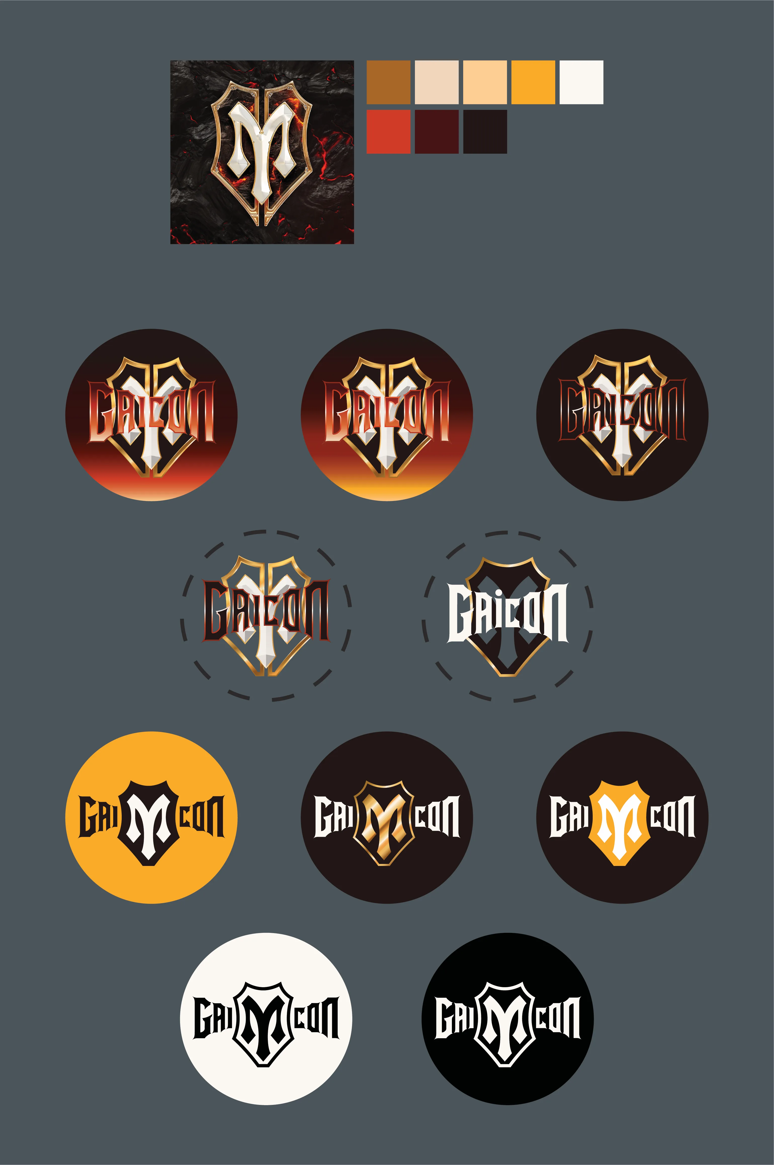
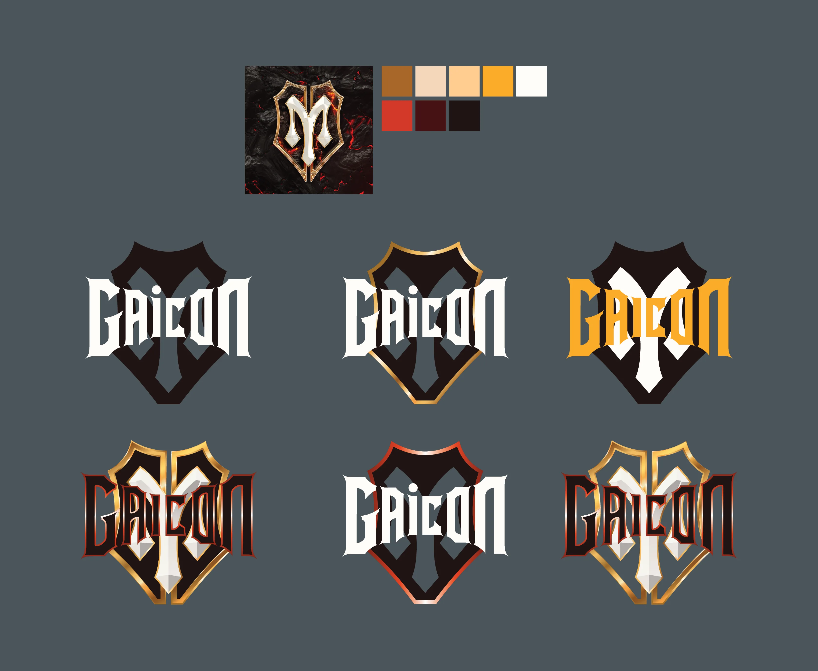
A logo has to survive being shrunk. This is my remaster of the Gai Con mark for a Vietnamese music competition, rebuilt in vector so the franchise could put it anywhere. The wordmark sits inside a gold-edged shield with a blade cutting up through the middle, on a fire gradient that runs from black at the top to yellow at the base. Then the unglamorous work, which is the real work. Six lockups for light and dark grounds, a flat one-colour cut for when nothing else will print, and ten circular badges going down to the size where only the shield and the blade are left. Shrink it far enough and the name disappears. The shape still says it.

View
View
View