
Special Project
The Fantastic Four
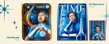
First Dreams
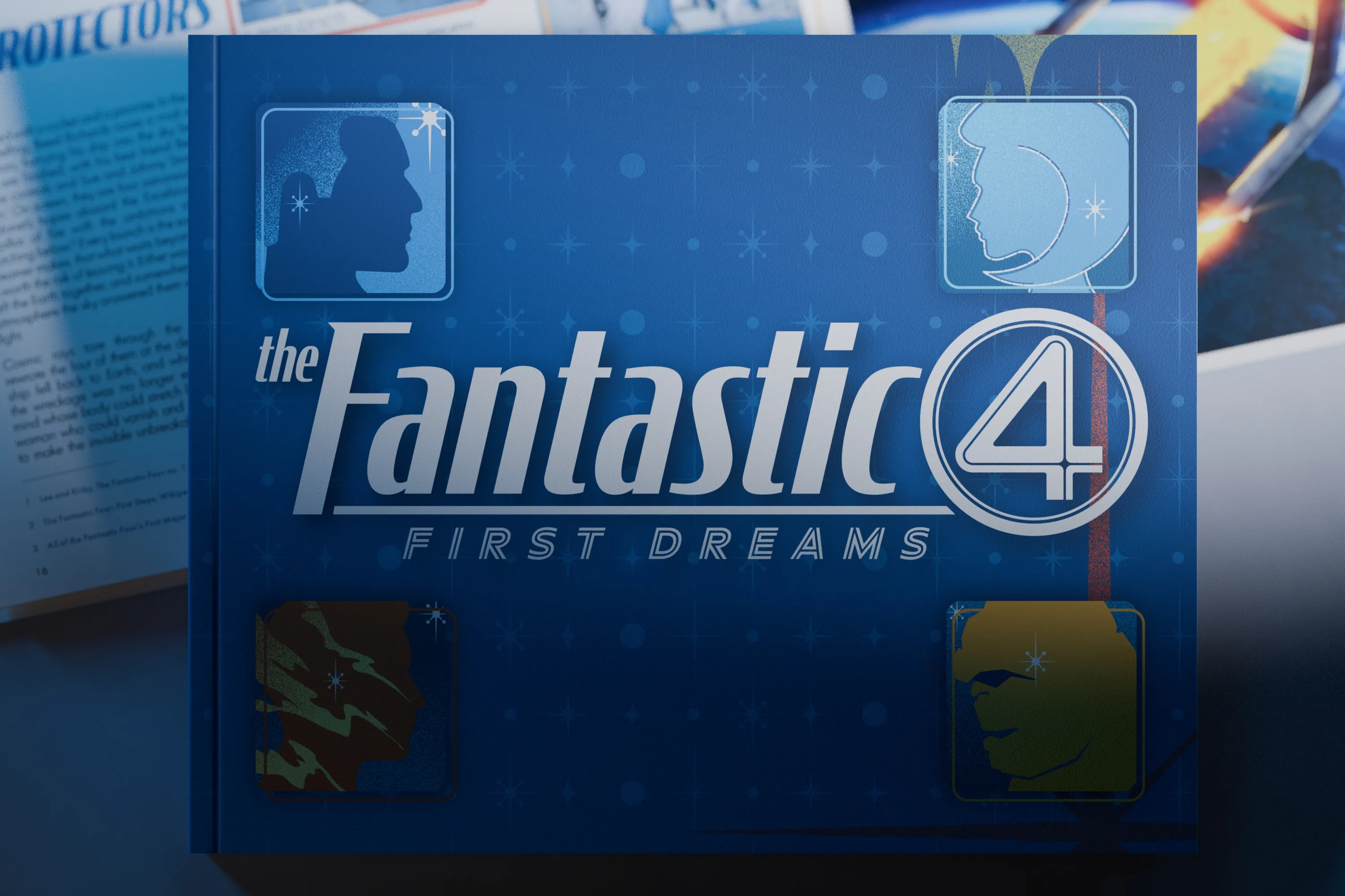
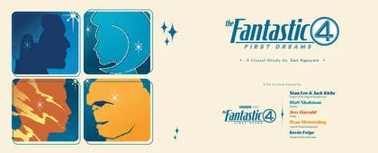
A self-initiated 64 page art book that turns a childhood dream into a working visual system, across 33 spreads and 17 pieces in four mediums.
A self-initiated 64 page art book that turns a childhood dream into a working visual system, across 33 spreads and 17 pieces in four mediums.
The order below is the order the project happened in. Jump anywhere.
What is on this page
Why the Fantastic Four
The killed title, and what else went
One board, two hundred elements
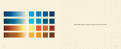
Four heroes, sixteen colours, four gradients
Five families, five registers
64 pages, 33 spreads, 7 missions
Three trials, then the composites
A research paper, designed as a magazine
Drawn once, placed everywhere
Block-in to material
109 frames, five posters
Two pieces, presented in FantastiVision
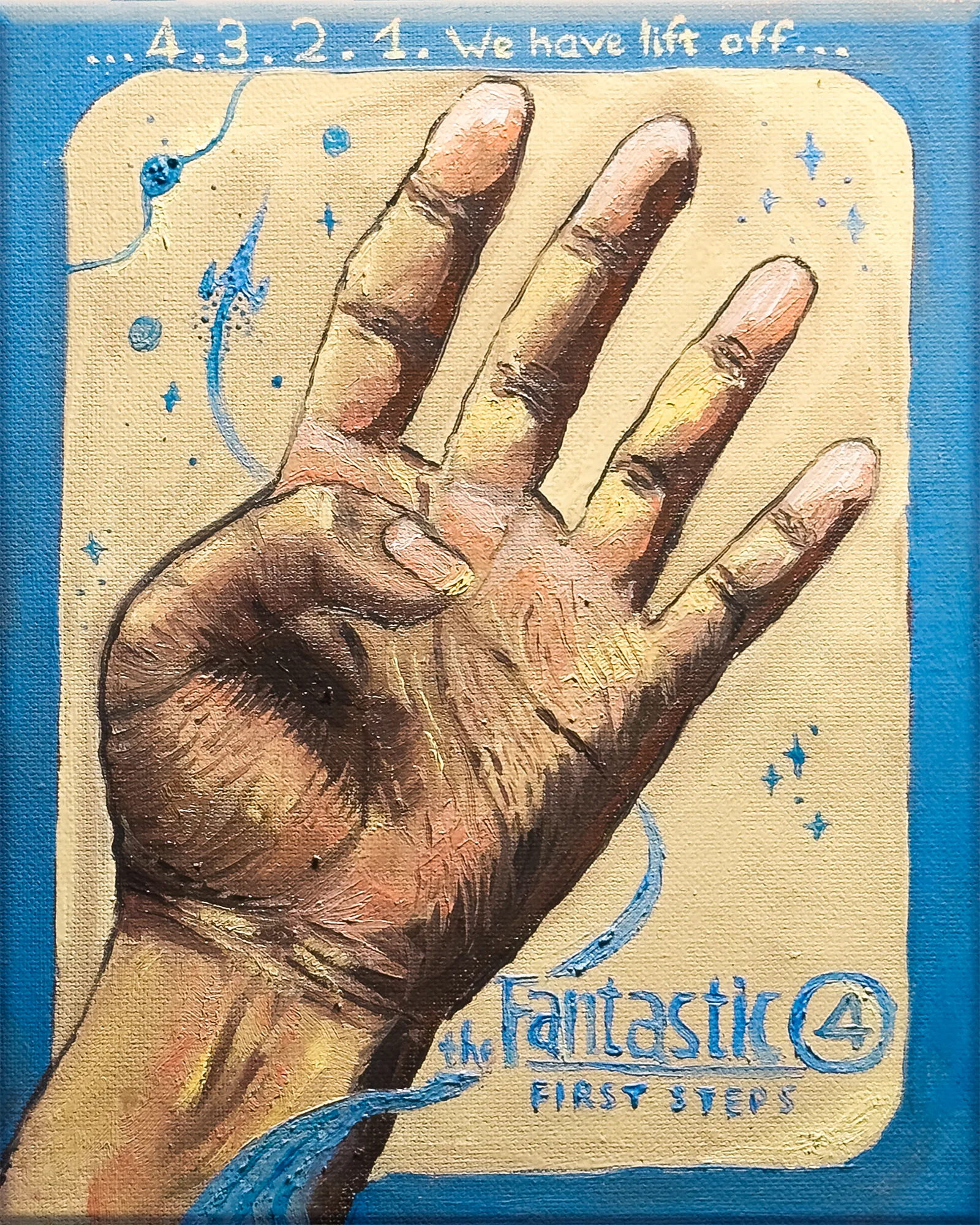
All seventeen pieces
What is still unbuilt
Why the Fantastic Four, and why now.
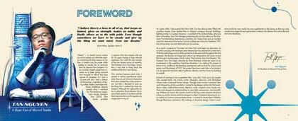
I did not want to be the hero. I wanted to be the person who drew him.
When I was ten I watched Fantastic Four for the first time and decided I would be a superhero. That belief lasted about as long as childhood does. What replaced it was quieter and more useful.
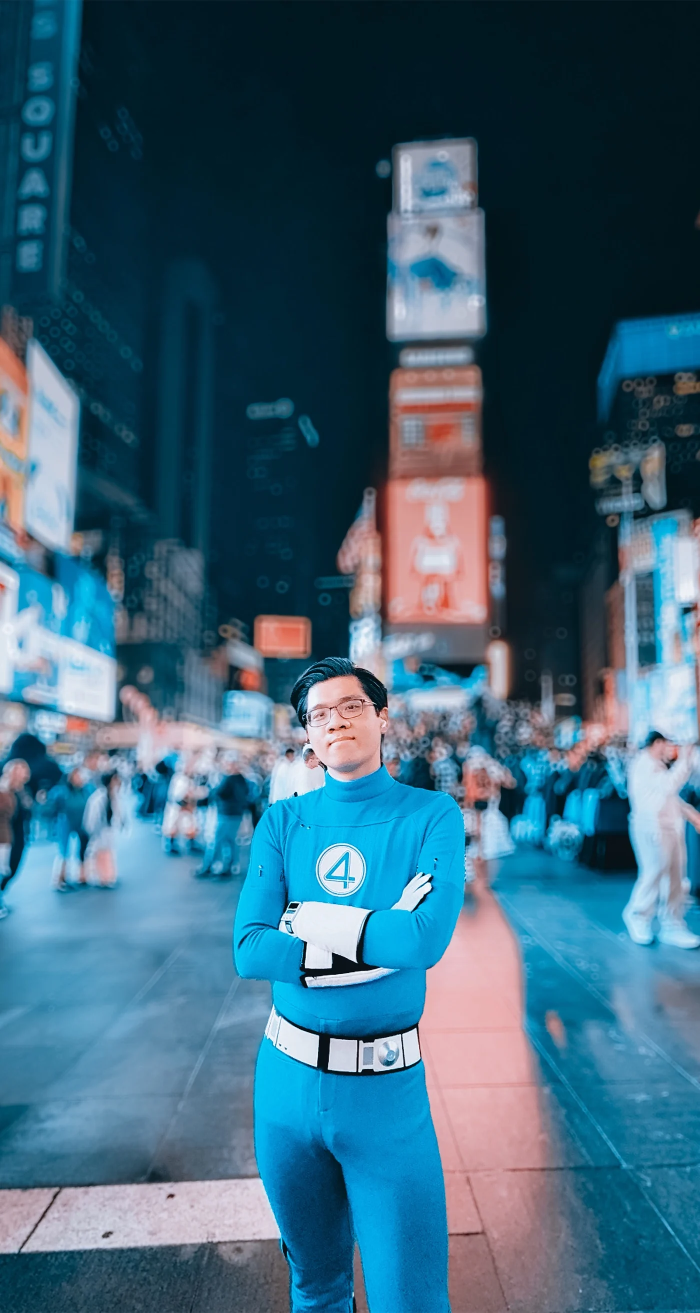
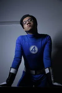
Ten years later the four of them came back on a screen in a city I had just moved to. Standing in Times Square in a costume I had bought for Halloween, I understood that the debt was still open. This book is how I paid it.
So the Fantastic Four are not the subject here. They are the instrument. Four people who climb into a rocket because they want to see what is on the other side of the sky, and who spend the rest of their lives turning the cost of that into something useful, are a good enough model for anyone deciding to become an artist.
 View
ViewTimes Square, October 2025. The photograph that started the poster series, and the only research trip that did not need a library.




One week lost, and the whole project found. What follows is the rest of what did not survive.
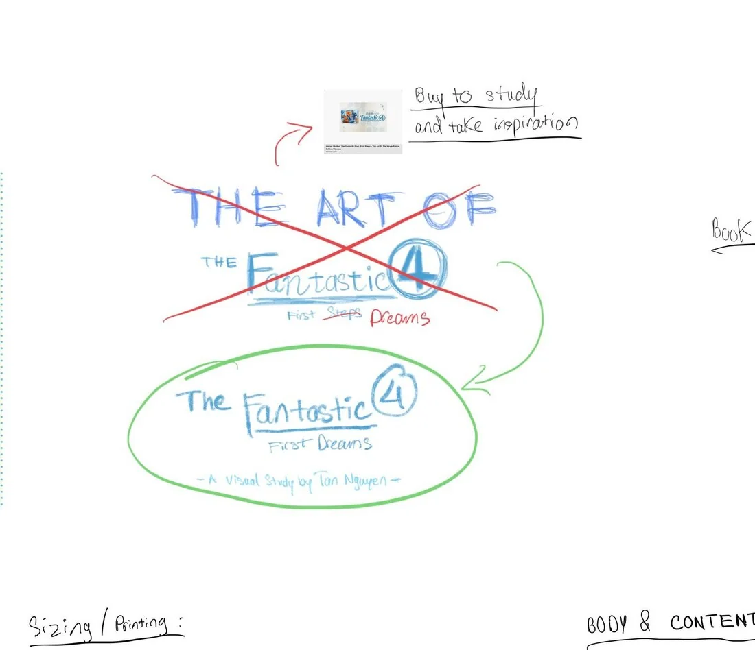
Fig. 01 Red through the old one. Green around the new one. Nothing else on a board of two hundred elements is drawn that emphatically.
The book was going to be called The Art of The Fantastic Four: First Steps. A week in I found that Marvel had already published a book under that name, written by Jess Harrold. I bought it, read it, kept it on the desk as reference, and changed mine.
Losing the title cost me a week and gave me the project. The Art Of would have made me a documentarian of somebody else's film. First Dreams made the film a lens and put the subject back where it belonged, which was the ten year old, the city, and the promise between them.
Marvel had already published a book called The Art of The Fantastic Four: First Steps. I found out a week in. Changing the title changed the subject, and the subject was better.
Four cover ideas went up on the board. Three came down to protect the deadline. They became the idea of a changeable cover wrap, four or five sleeves over one case. That idea is not finished either.
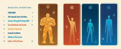
Yesterday's Tomorrow, Fantastic Aesthetics and Melody of The Cosmic were designed into the contents page and then cut to make the class deadline. Melody of The Cosmic was never researched at all. The contents page still lists it.
Drag to move. Use the buttons or double click to zoom, so the page keeps scrolling under your wheel. The jump buttons go straight to the parts worth reading.
Fig. 02 Project board, built in Freeform. Roughly 274 by 198 inches at full size. Served here at 13,158 by 9,521 pixels.
Oil paint, gouache, coloured pencil, marker, photography and vector do not agree about colour. The palette is the agreement. Every colour in the book belongs to one of the four, and each one has a job. Drag a gradient node to see how the ramp was built.

Reed Richards
Mister Fantastic
The mind that will not stop reaching. Reed is the reason the project runs across nine media instead of one, and the reason a single palette had to hold all of them.
The project accent. Titles, rules, and anything the reader can act on.
Diagram lines, the perspective grid, the keylines around a panel.
Body text on cream. The same ink the site uses on all thirty three work pages.
Ground for the mission openers, where the book goes dark before a chapter.
Ascent
Sue Storm
Invisible Woman
The parts nobody credits. The dot field, the folio position, the gutter margin, and the four spreads that are almost empty on purpose.
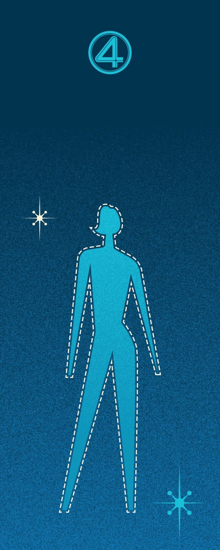
The dashed outline around her figure, and every containment shape in the book.
Secondary panel fills where the page needs air rather than emphasis.
The halftone dot field. It appears on more spreads than any other colour.
Shadow side of the cool range. Used under things, rarely on top of them.
Dissolve
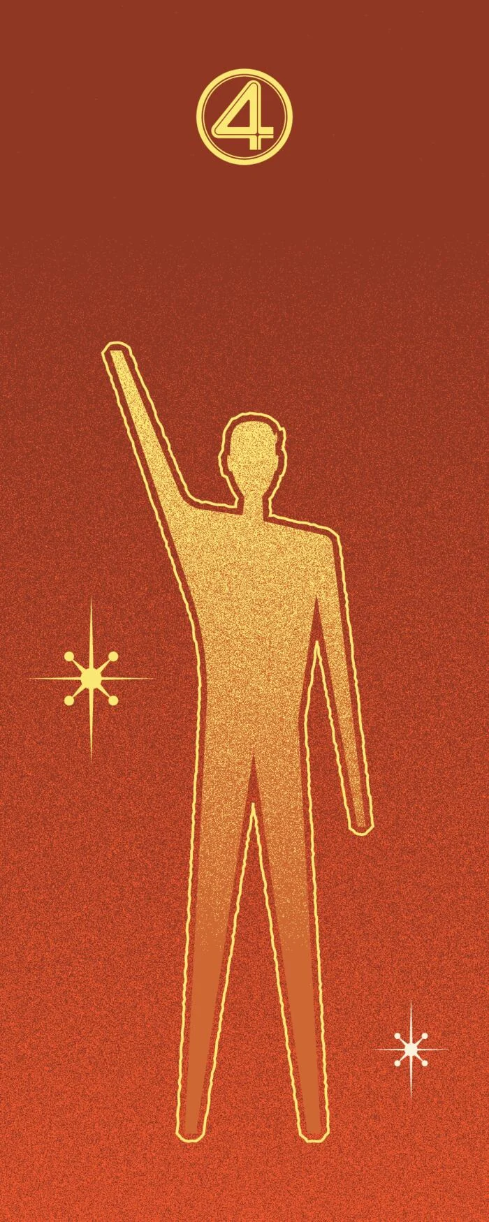
Johnny Storm
Human Torch
One hot colour per spread, at most. That restraint is the only reason flame still reads as flame on the twentieth spread.
Hand-drawn rules and keylines. The countdown lettering on Four The Stars.
The hottest colour in the book. Used once per spread and never twice.
Engine light and contrails, where heat has to read as motion.
What is left after the fire. The dark end of the warm range.
Re-entry
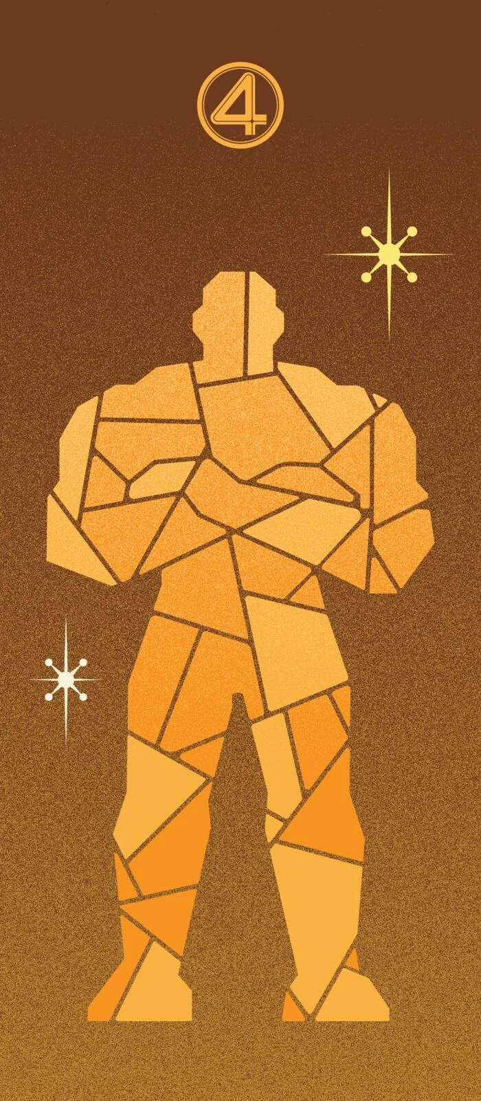
Ben Grimm
The Thing
Hold the system when the deadline pushes. The grid, the palette and the type scale did not move once they were set, even when three chapters had to go.
Warm highlight. The lit face of a rock plate, and the gold rule on the Kirby portrait.
The mid tone of his body, and the only orange allowed to fill a large area.
Where the plates turn away from the light. Matter rather than heat.
The darkest warm in the system. It anchors a page that would otherwise float.
Strata
Condor carries a width axis, so a single family behaves like several. Futura holds the reading. Neuwelt Inline is allowed once per chapter and never twice. Move the controls and the whole specimen responds, which is the fastest way to find out whether a system survives being pushed.
Condor Wide, 700. Covers, mission titles, the wordmark. The width does the shouting so the size does not have to. Condor itself reaches 800; the width variants stop at 700.
Condor, 800 italic. Heading 1 where the page needs speed rather than width. The only cut in the family that reaches Black.
Condor Compressed and Condensed, 700. Section labels and panel headers. Always caps, always tracked, always small.
Neuwelt Inline. Eyebrows, and the chapter titles in Mission III. Once per chapter, never twice.
Futura 100 Book. Body copy. Geometric, and genuinely of 1961 rather than an imitation of it.
Futura PT, all widths and weights. Captions, footnotes, tags, credits. Everything that supports the reading without joining it.
Digital-7. Numerals only, inside the Excelsior telemetry panel. The one place in the book where type is allowed to look like a machine set it.
The artbook is where every other part of the project ends up. Read it here, or walk the complete index below.
The book is a case bound hardcover at 10 by 8 inches closed, 20 by 8 open, running 64 pages across 33 spreads. It carries an editorial system built for nine different media, twenty-five Chicago footnotes, a Notes page and a fifteen-entry bibliography. Four of its seven missions are built. The other three exist as designed openers and a dash in the contents page, which is the honest state of it.
 01
01 02
02 03
03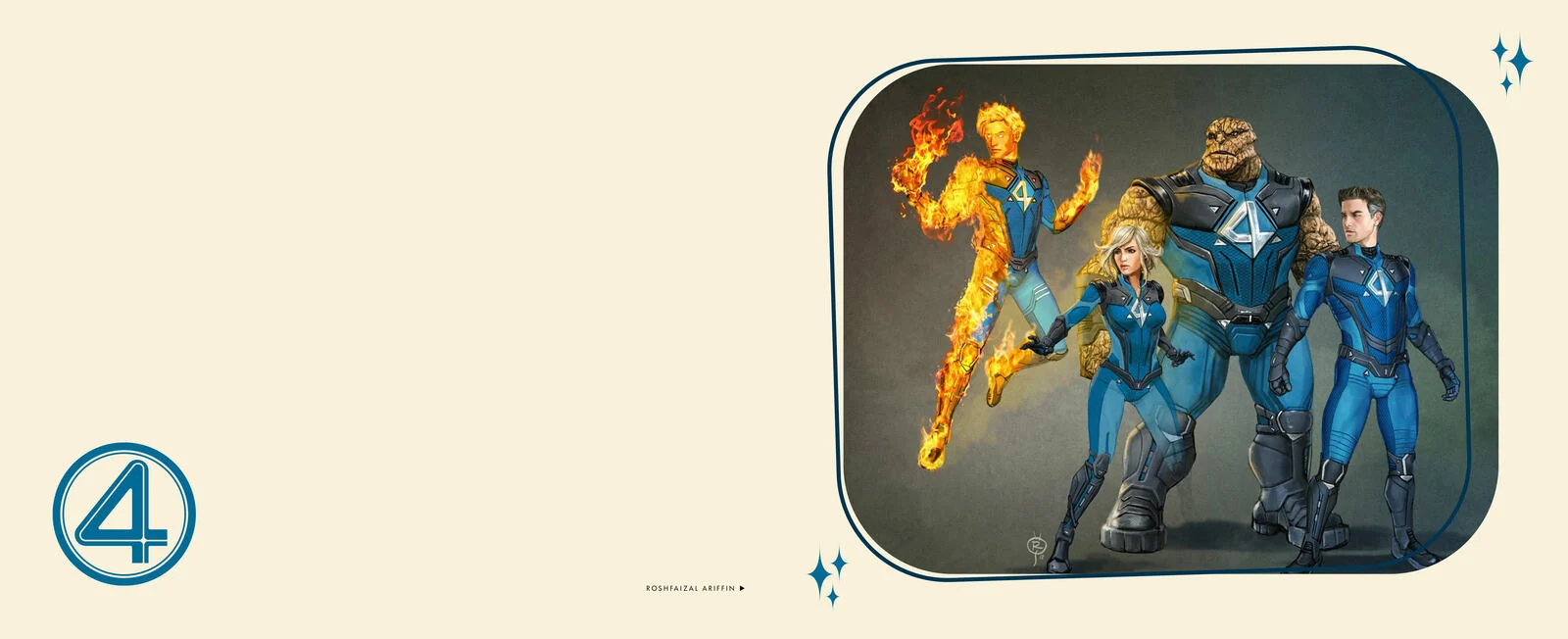 04
04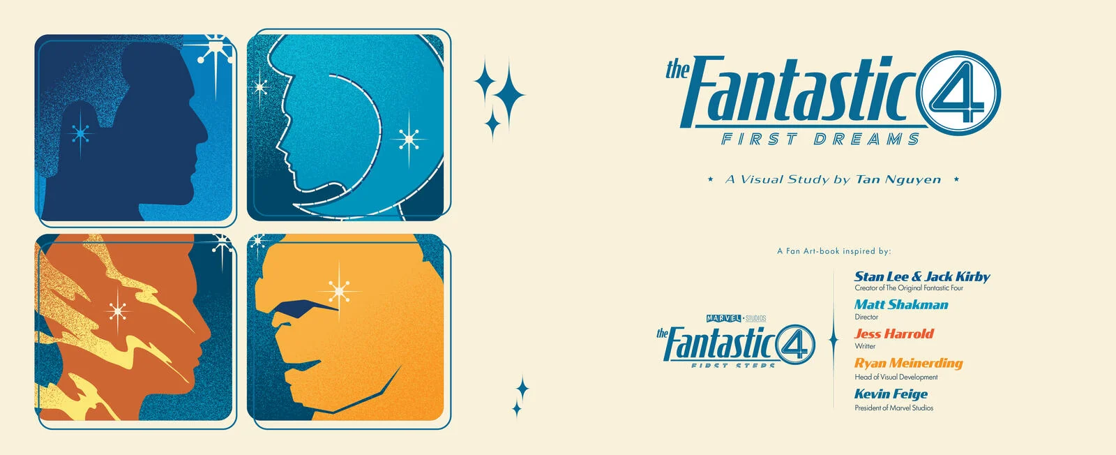 05
05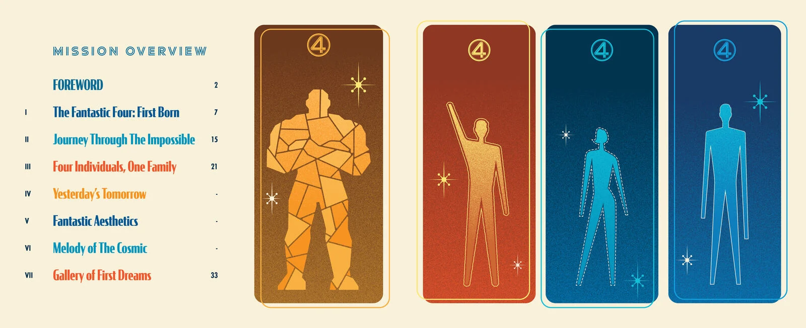 06
06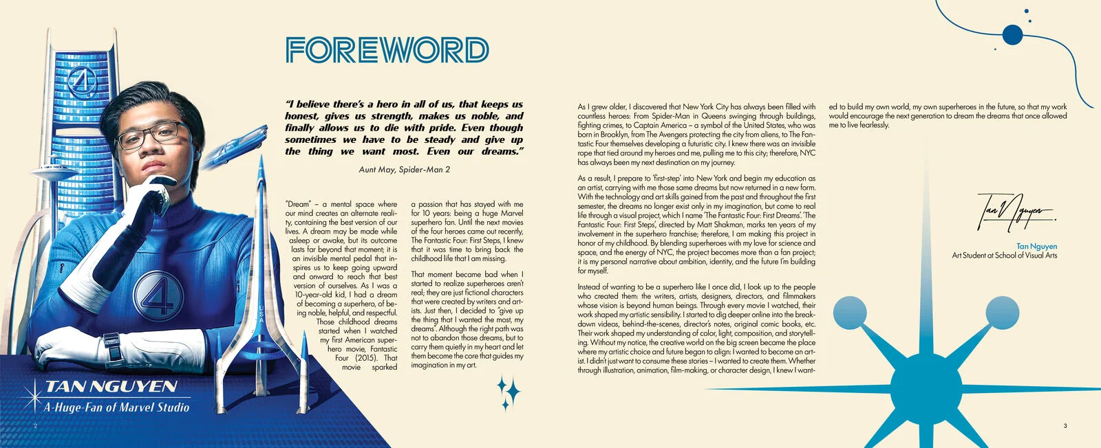 07
07 08
08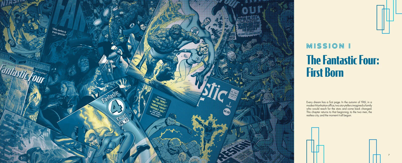 09
09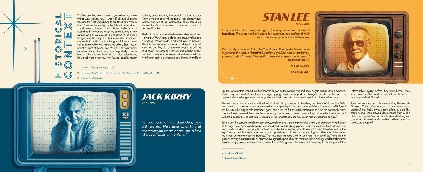 10
10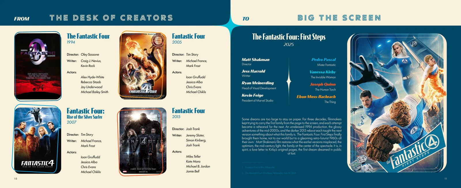 1112
1112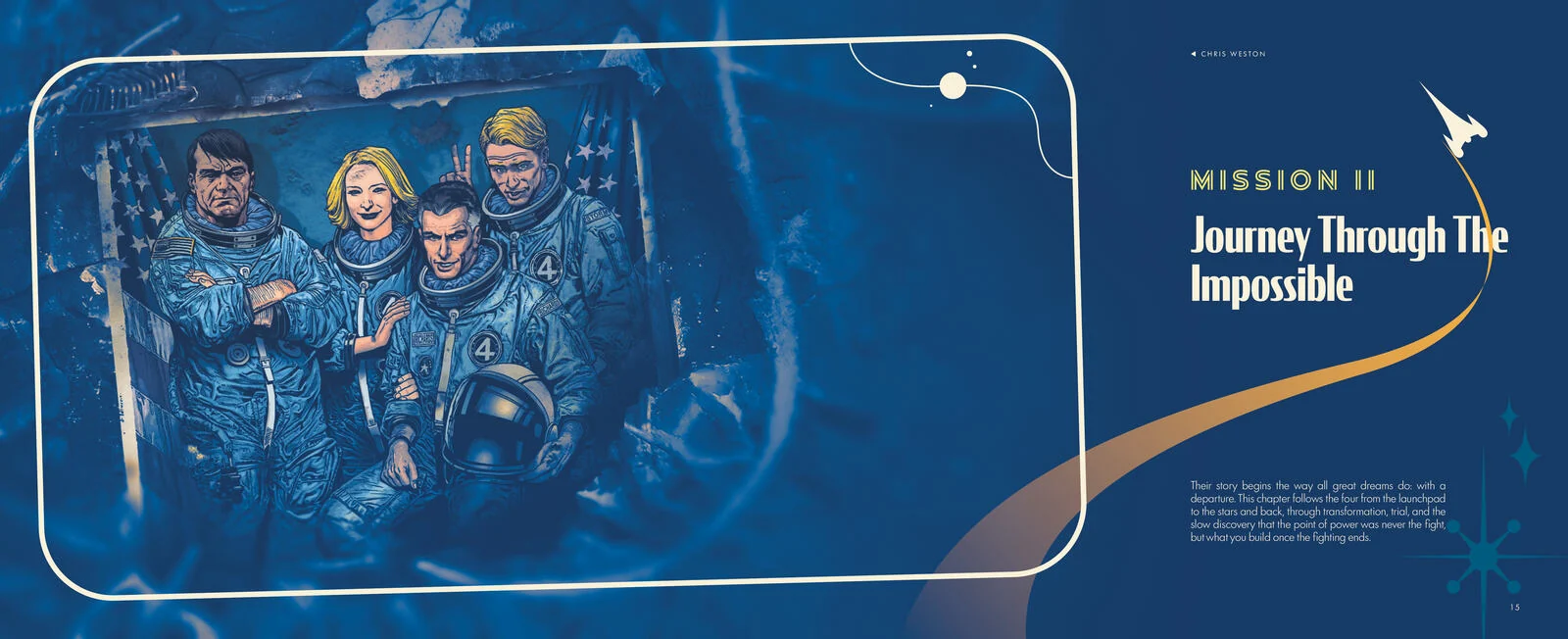 13
13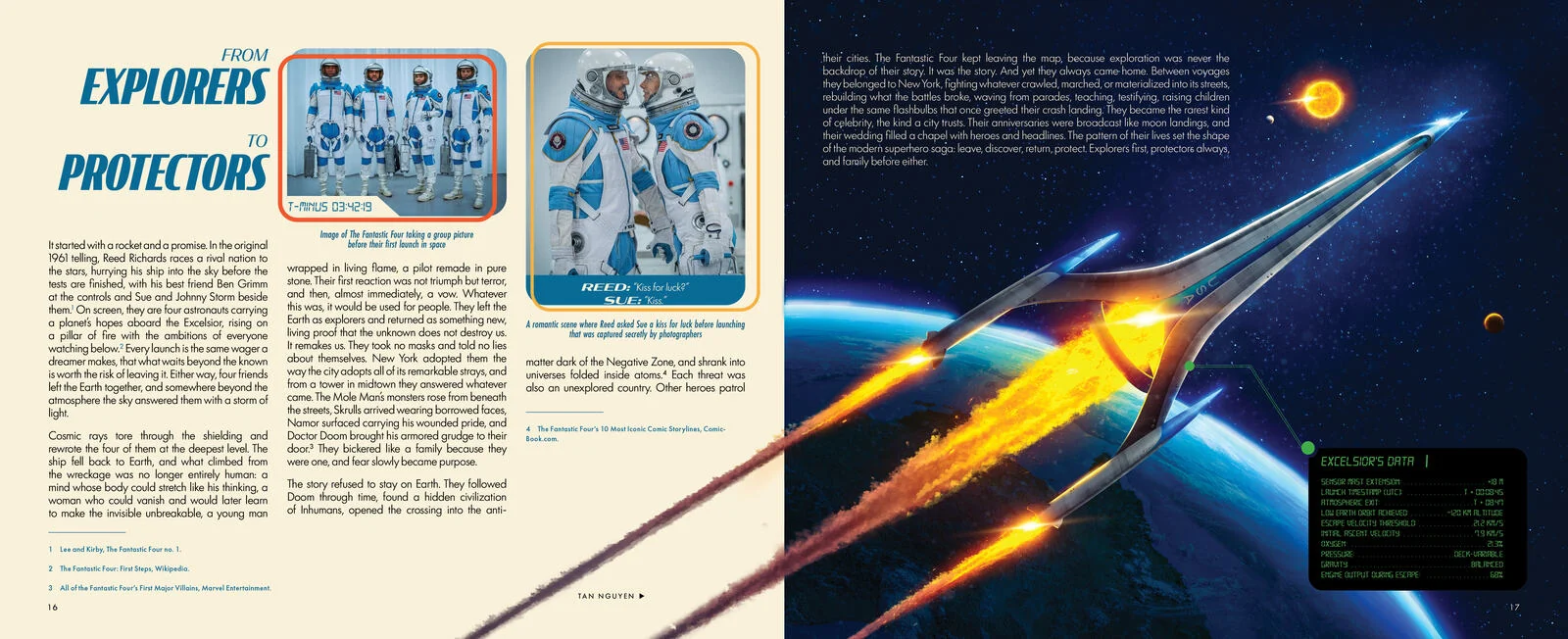 14
14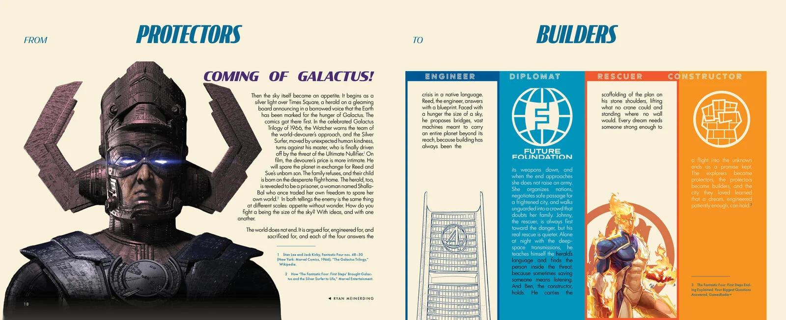 15
15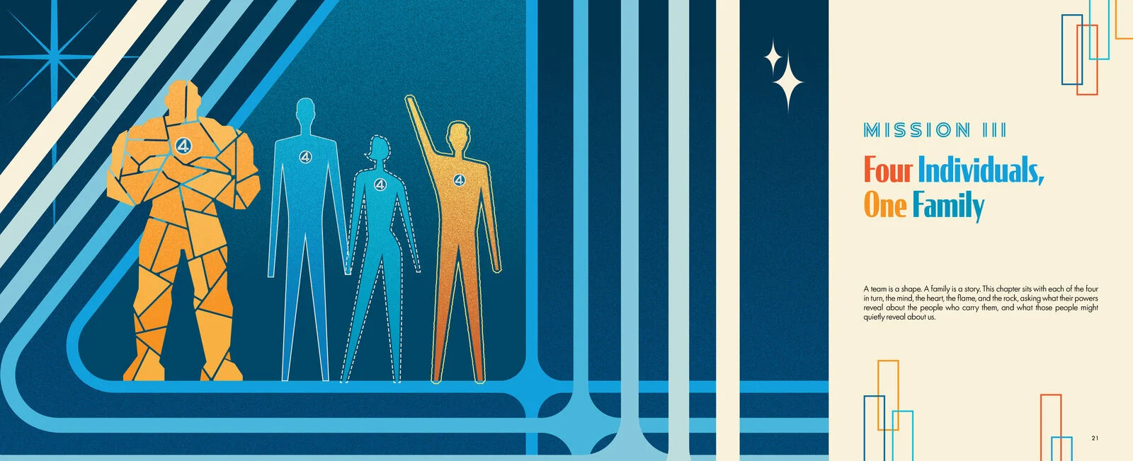 16
16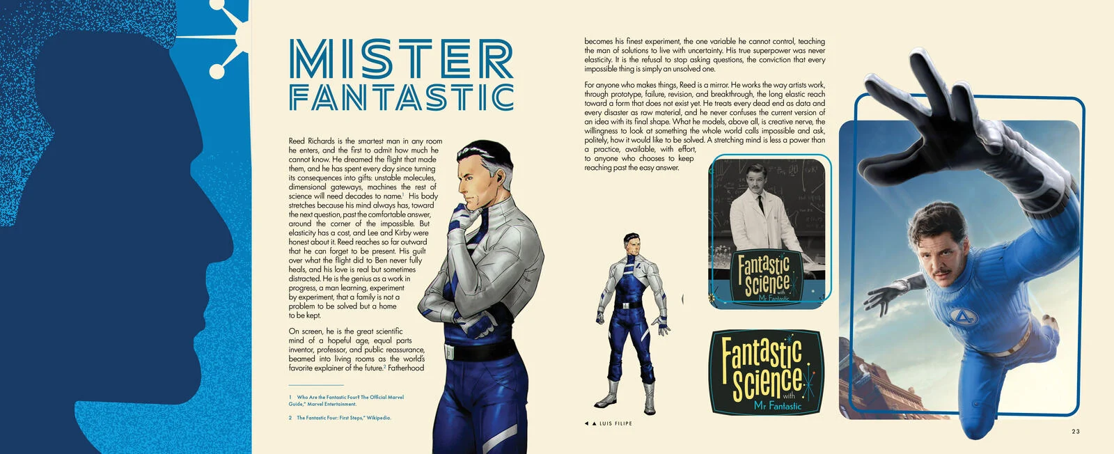 17
17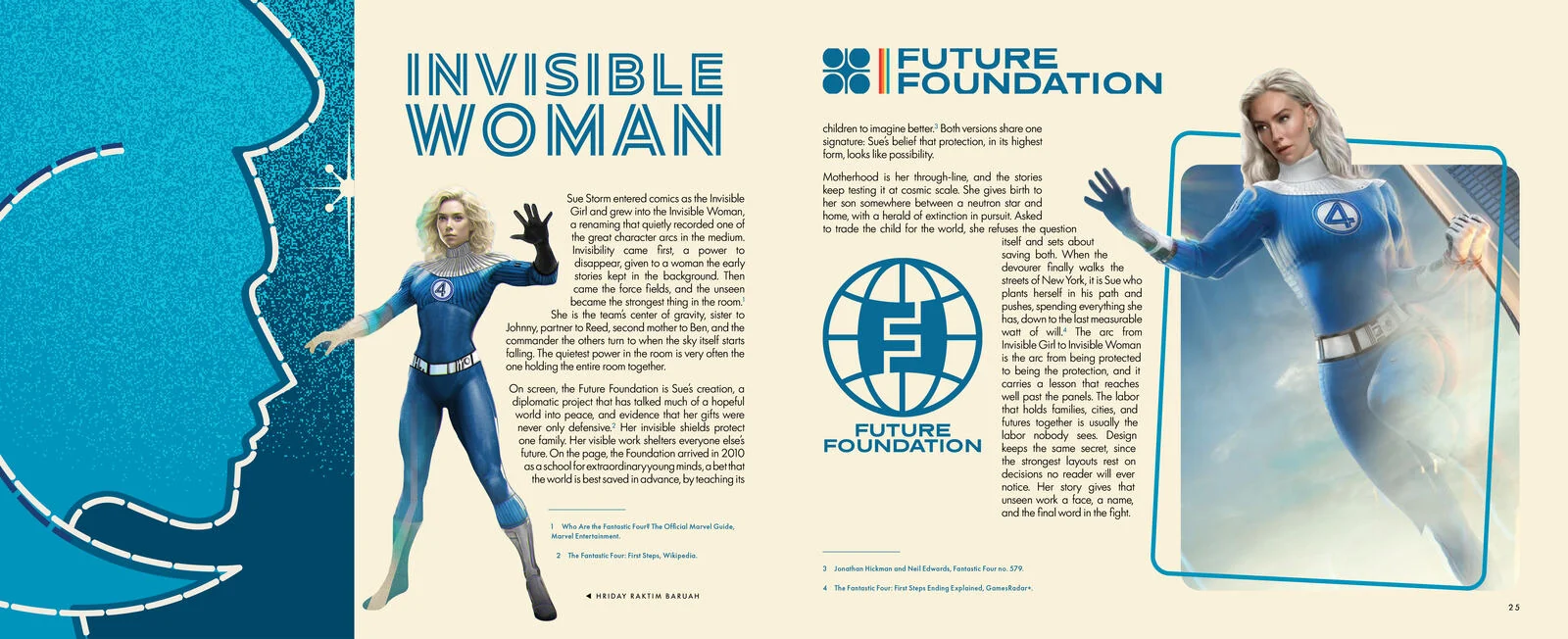 18
18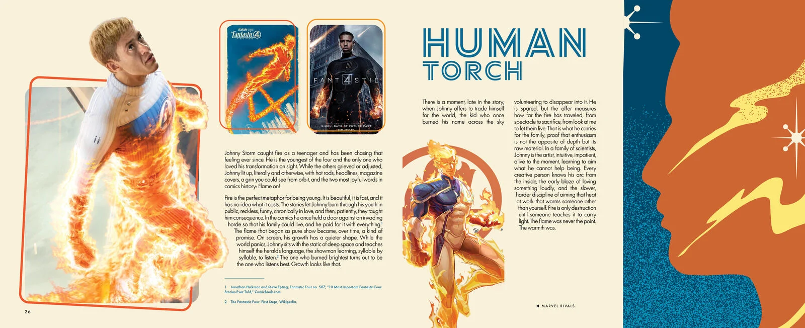 19
19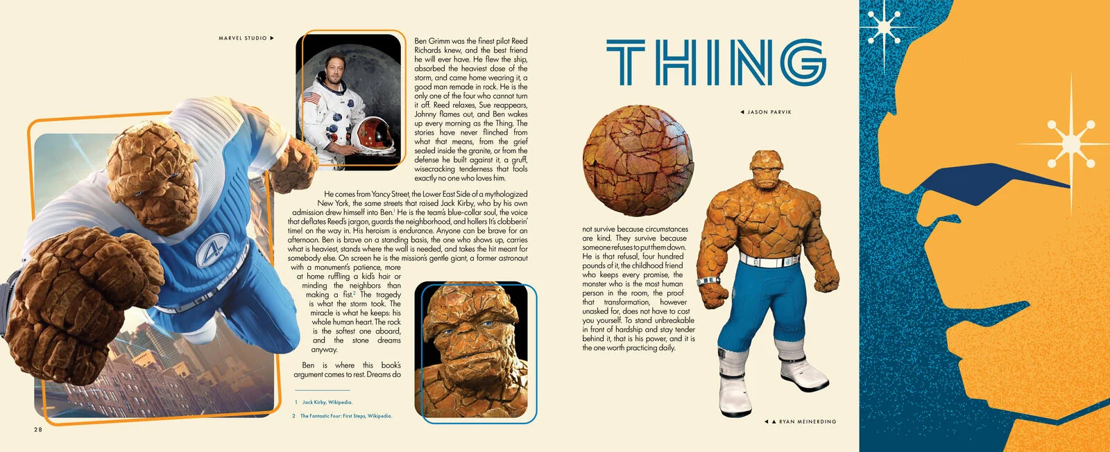 2021
2021 22
22 23
23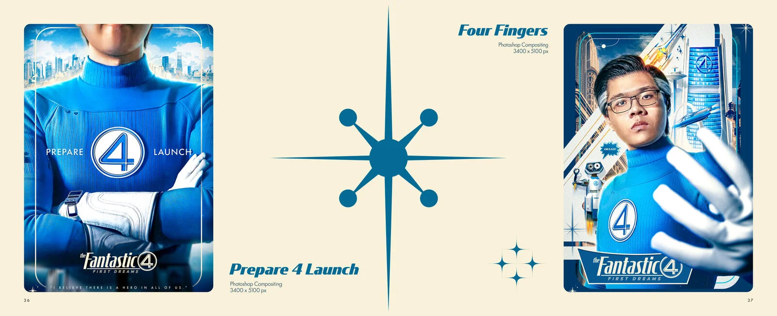 24
24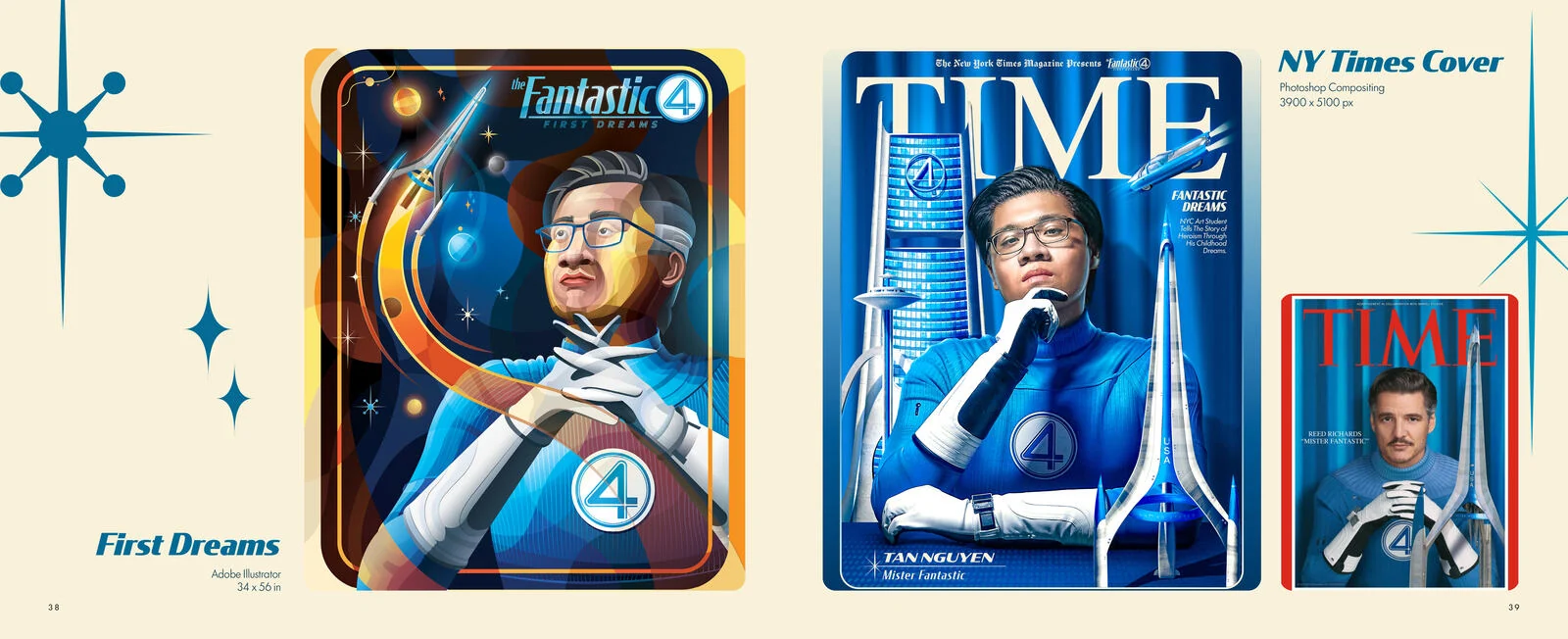 25
25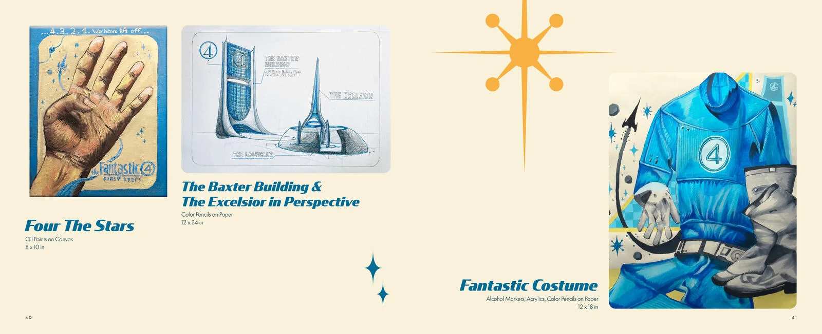 26
26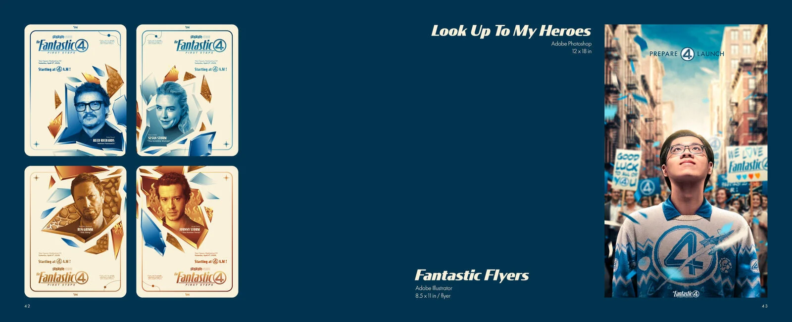 27
27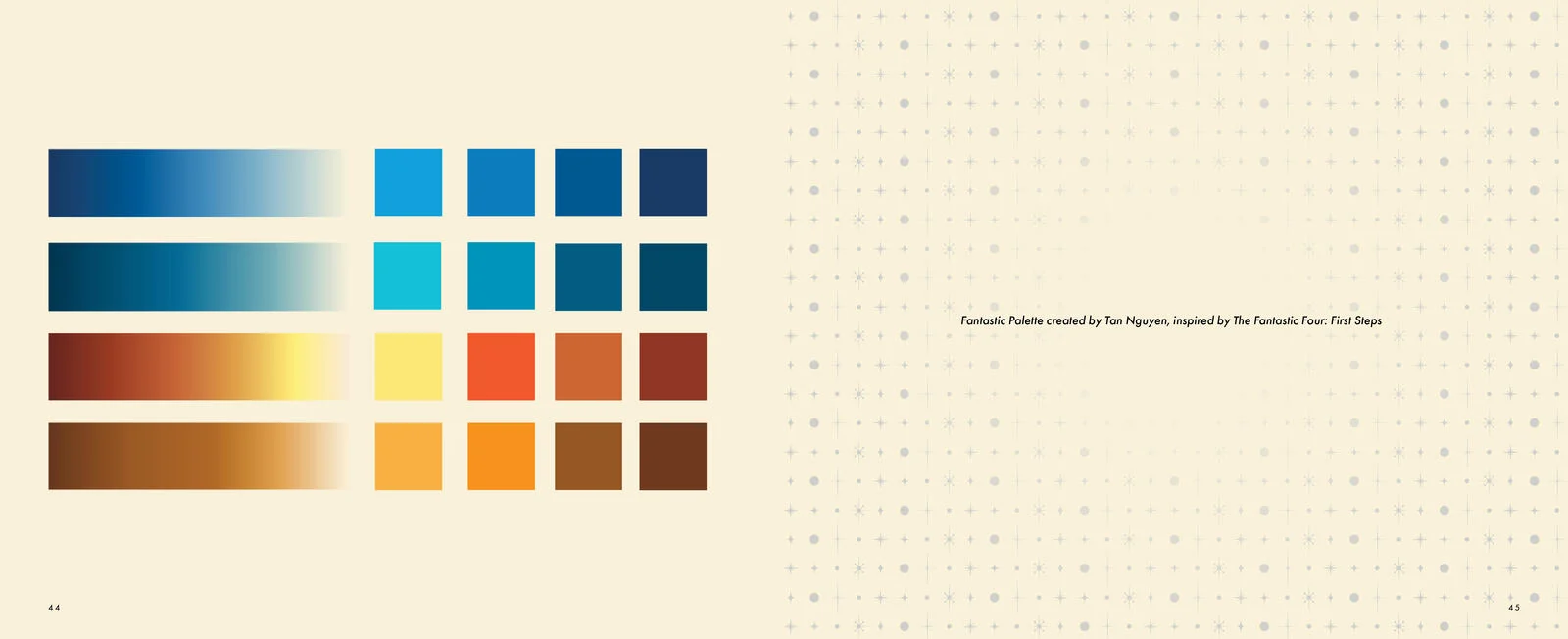 2829
2829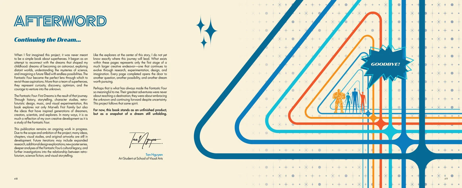 30
30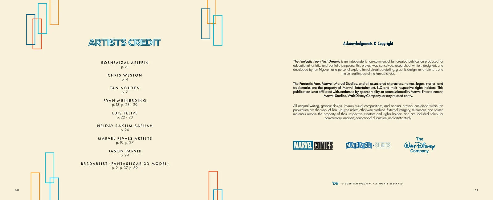 3132
3132 33
33Where the team came from, and why 1961 was ready for them.
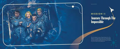
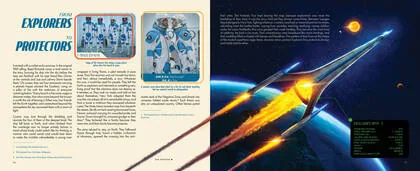
Launch, transformation, and the discovery that the point was never the fight.
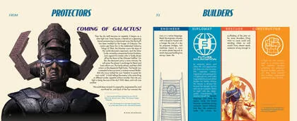
One chapter per member. Reed, Sue, Johnny, Ben.
Retrofuturism, architecture, the Baxter Building, furniture, 1960s New York.
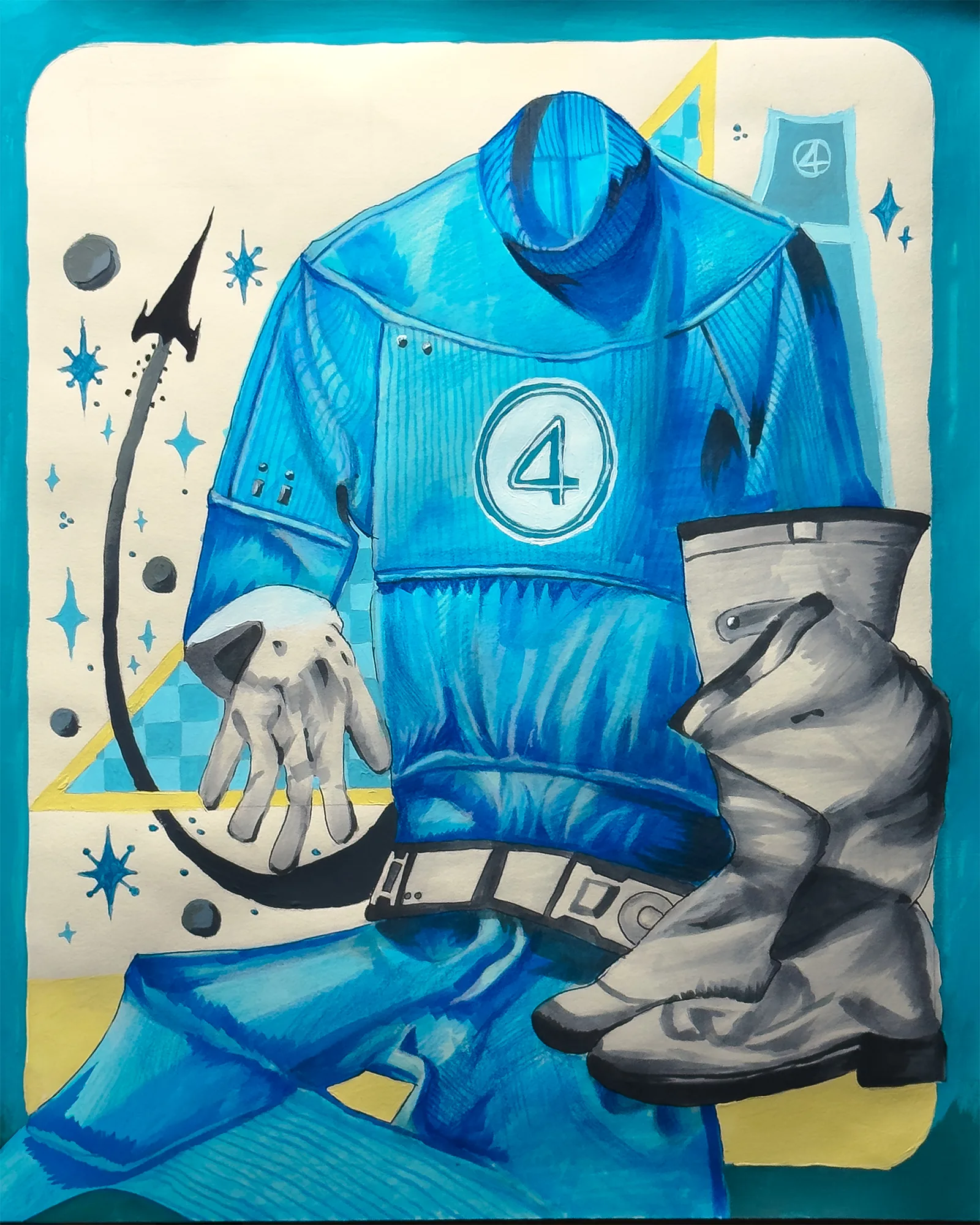
Costume design, the circled four, the logo, and Kirby line.
Score and sound. Never researched, never written.
The dream made visible. Opener written, gallery laid out.

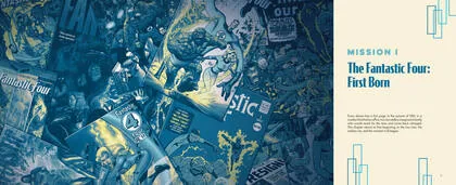
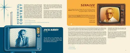
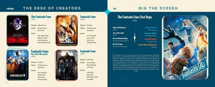
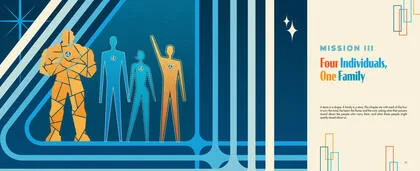
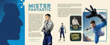
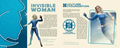
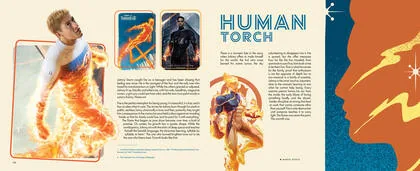
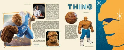
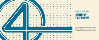
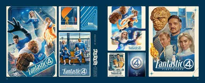
Three trials, one variable at a time, then duplication and compositing.
Everything in this section is a 3D visualisation made in Blender from the production cover artwork, at 10 by 8 inches closed, 64 pages of 170 gsm stock, a 4.94 mm page block and a 9.94 mm case spine. It is a model of a real specification, not a photograph of a real object. Print is the next stage of the project.
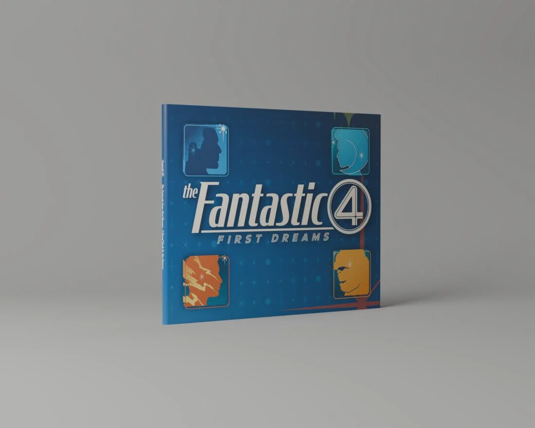 View
ViewA 3.38 mm spine bulge, the default hardcover profile. Look at the case edge. It curves, and a curved spine reads as a novel rather than an art book.
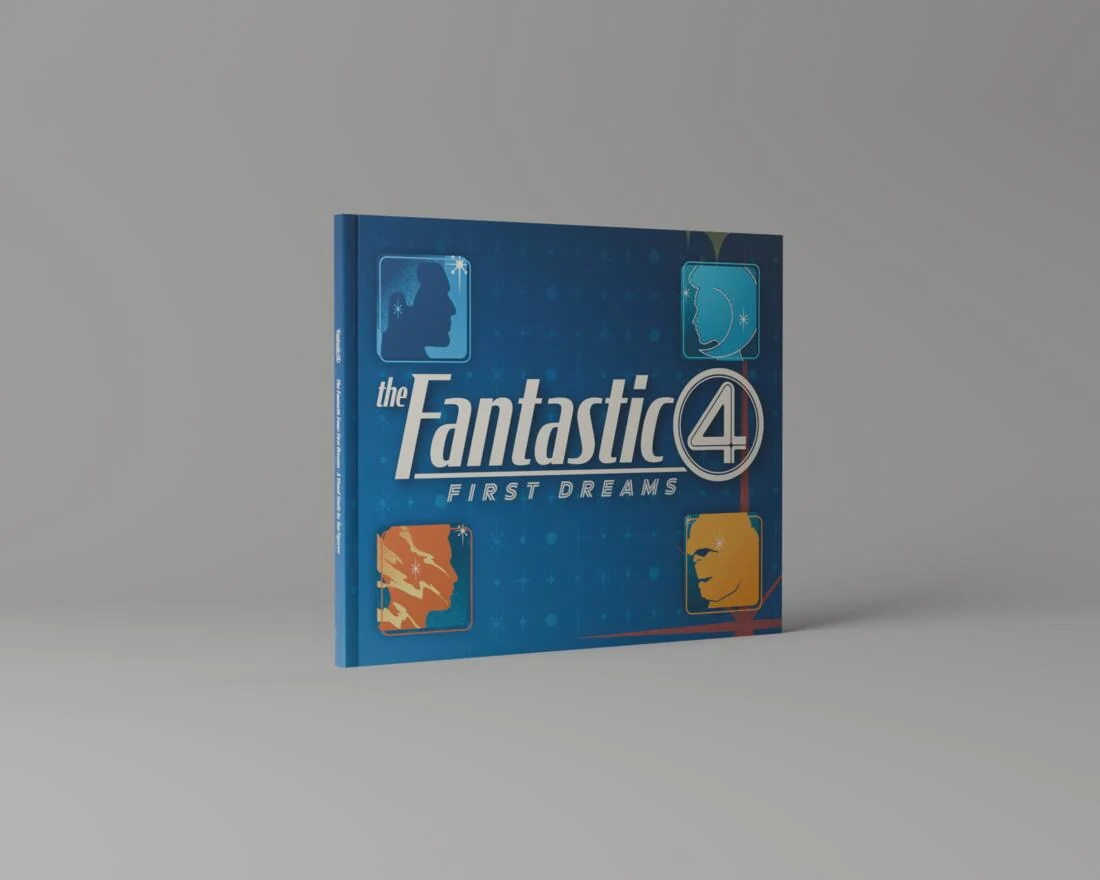 View
ViewFlat spine, 1.2 mm corner radius, pressed hinge grooves. Same crop, same light. The edge is straight now, and the cover reads as a plane rather than a curve.
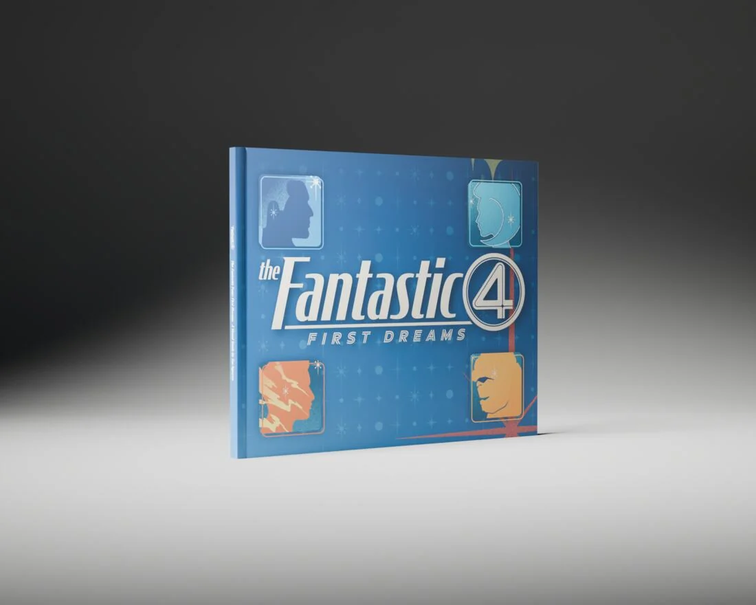 View
ViewGeometry frozen, lighting rebuilt. A single hard key with a long falloff, which is the light the book itself is drawn in.
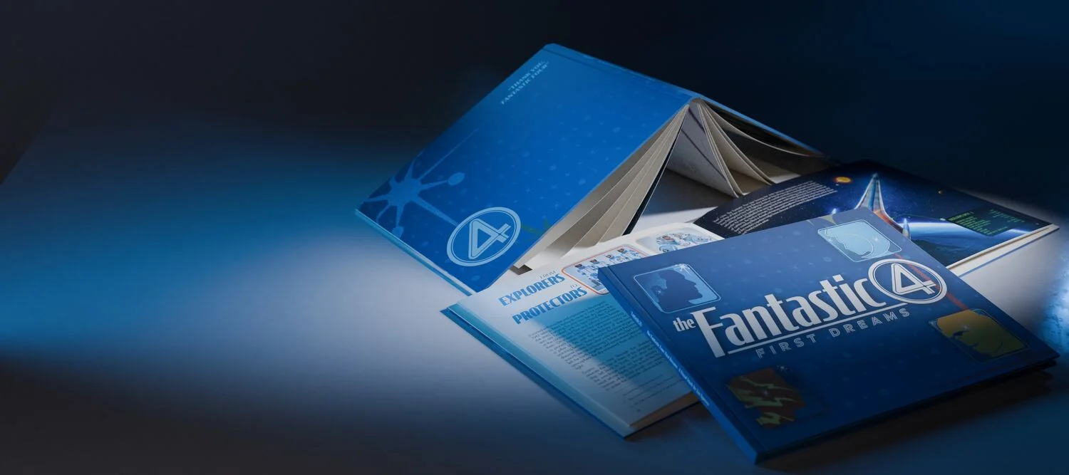
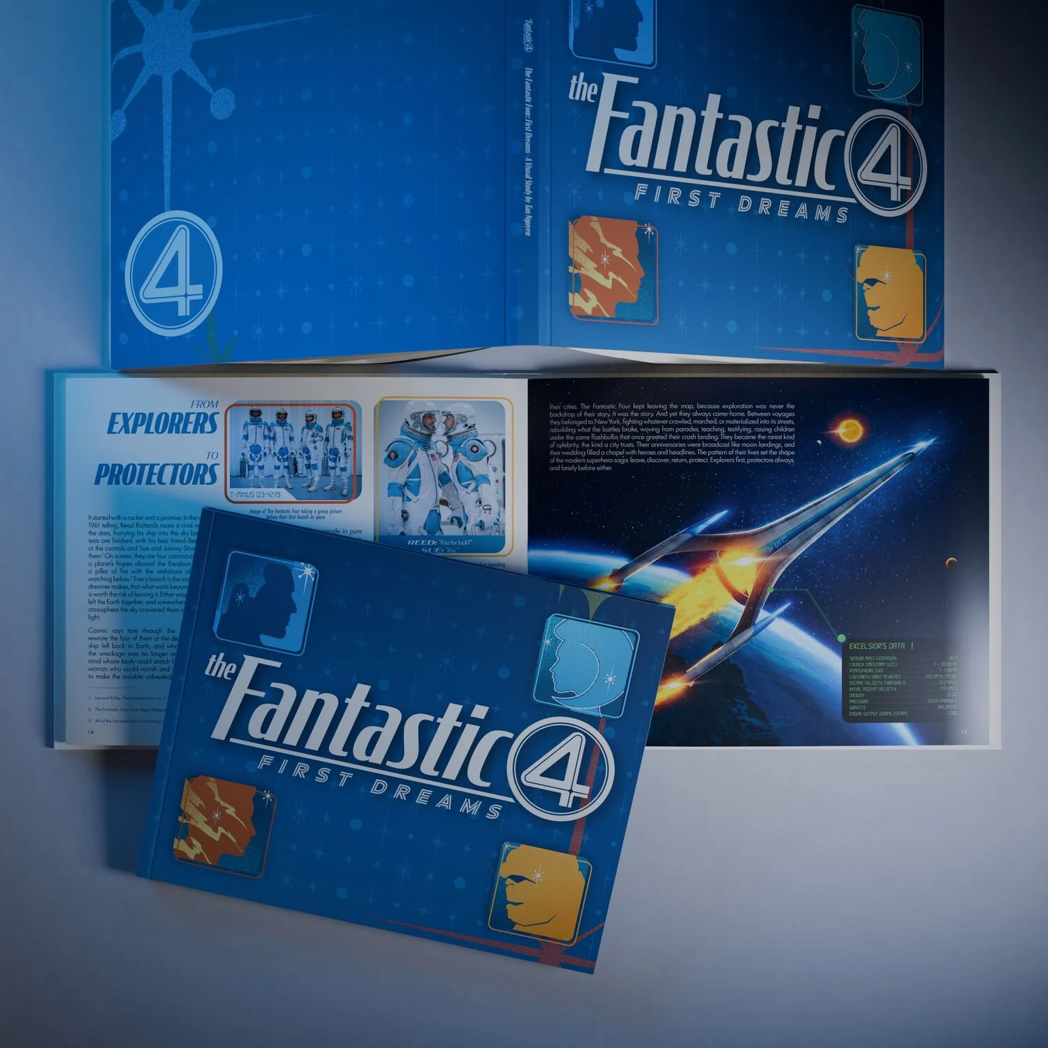 View
ViewTop down on the full cluster. The flat wrap is visible at the back, front and back cover in one plane.
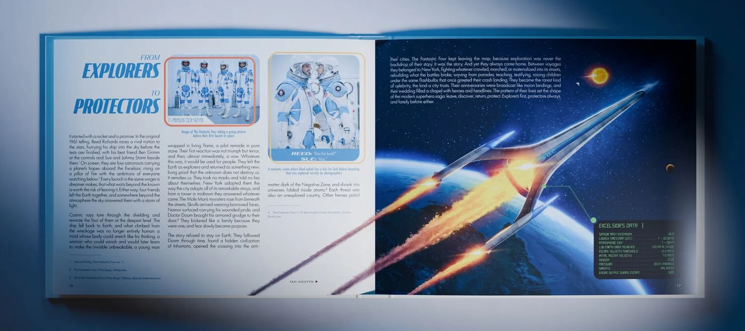 View
ViewOpen flat, top down. The Excelsior spread at full width, with two closed copies behind.
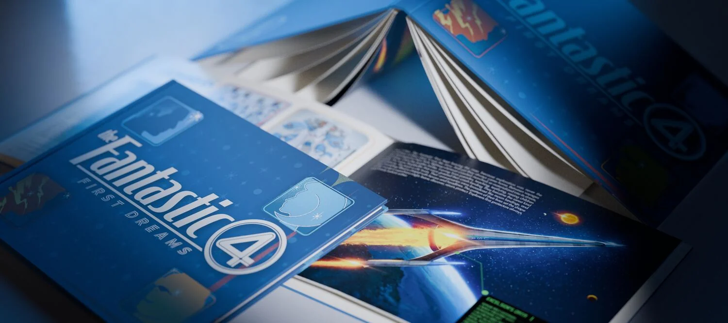 View
ViewThree quarter from the right. Open volume left, closed volume right.
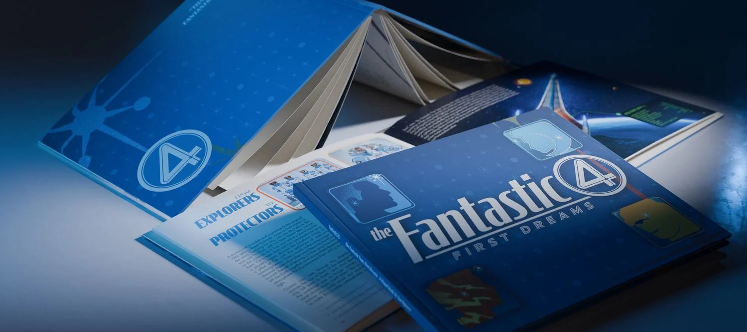 View
ViewThe same cluster from the left. Closed copy forward, the fan of pages catching the key.
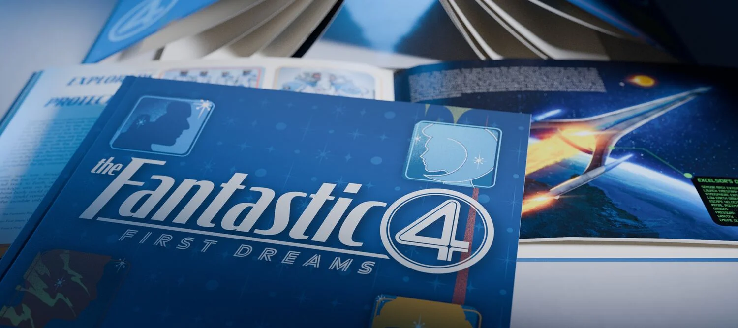 View
ViewThree books in one comp. Open face up at the back, closed in front, a third turned away.
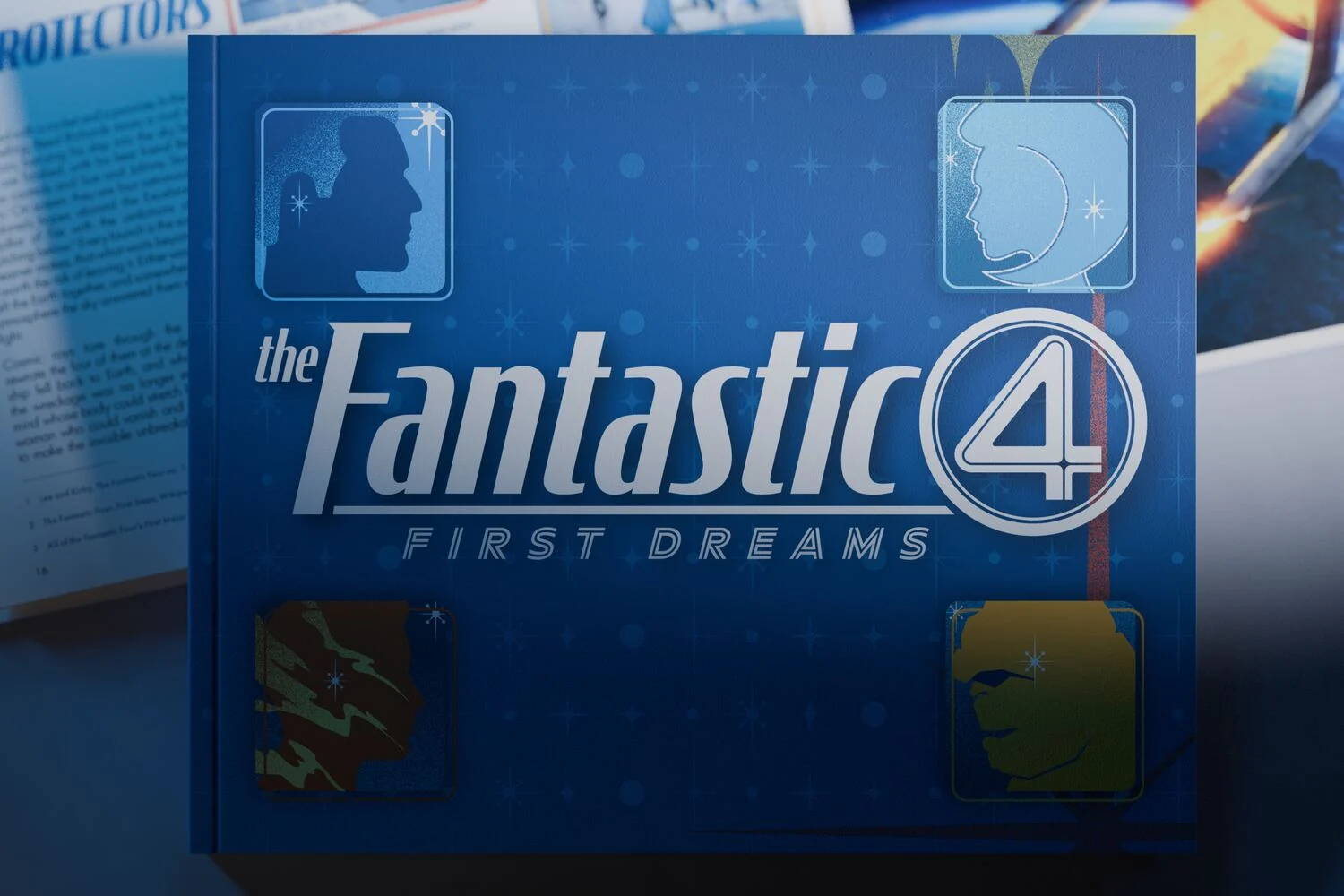 View
ViewClosed, front on. A second copy lies open behind it so the case and the block read together.
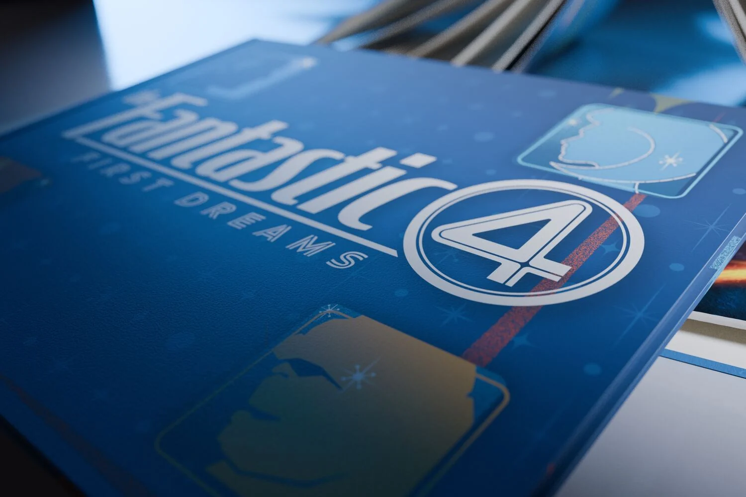 View
ViewMacro on the case corner. Board overhang, page recess and the hinge groove, at the specified caliper.
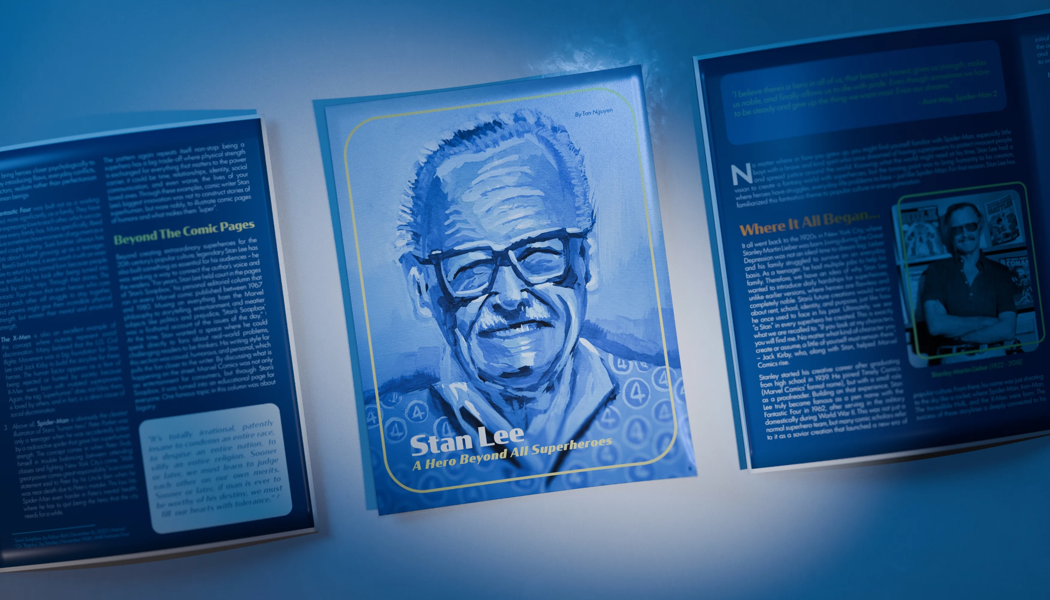
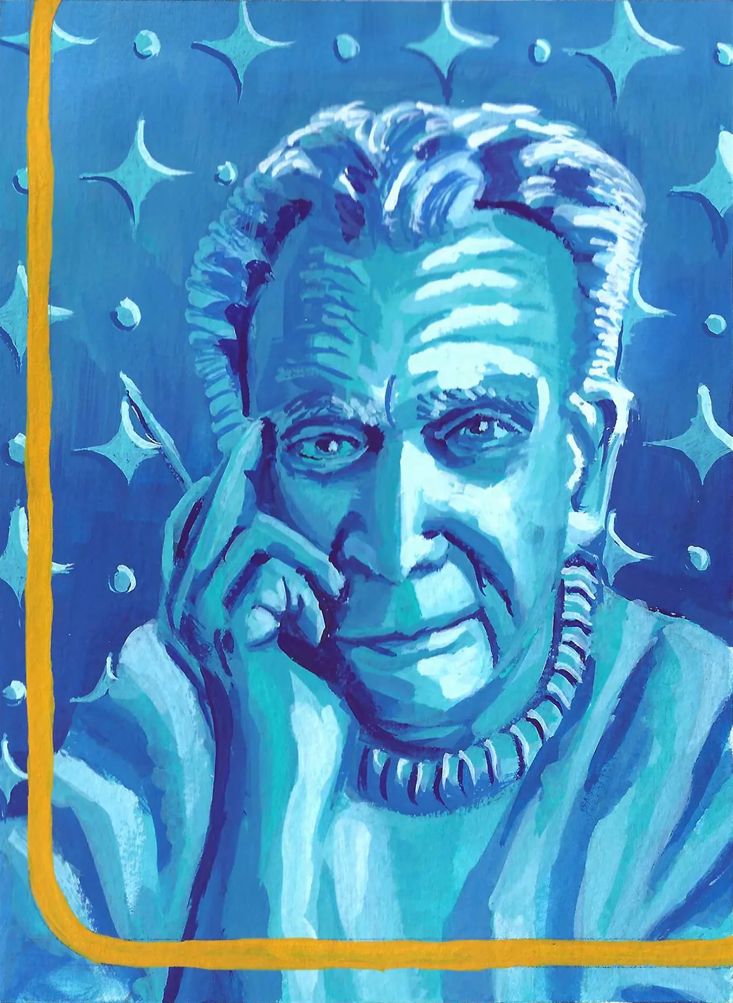
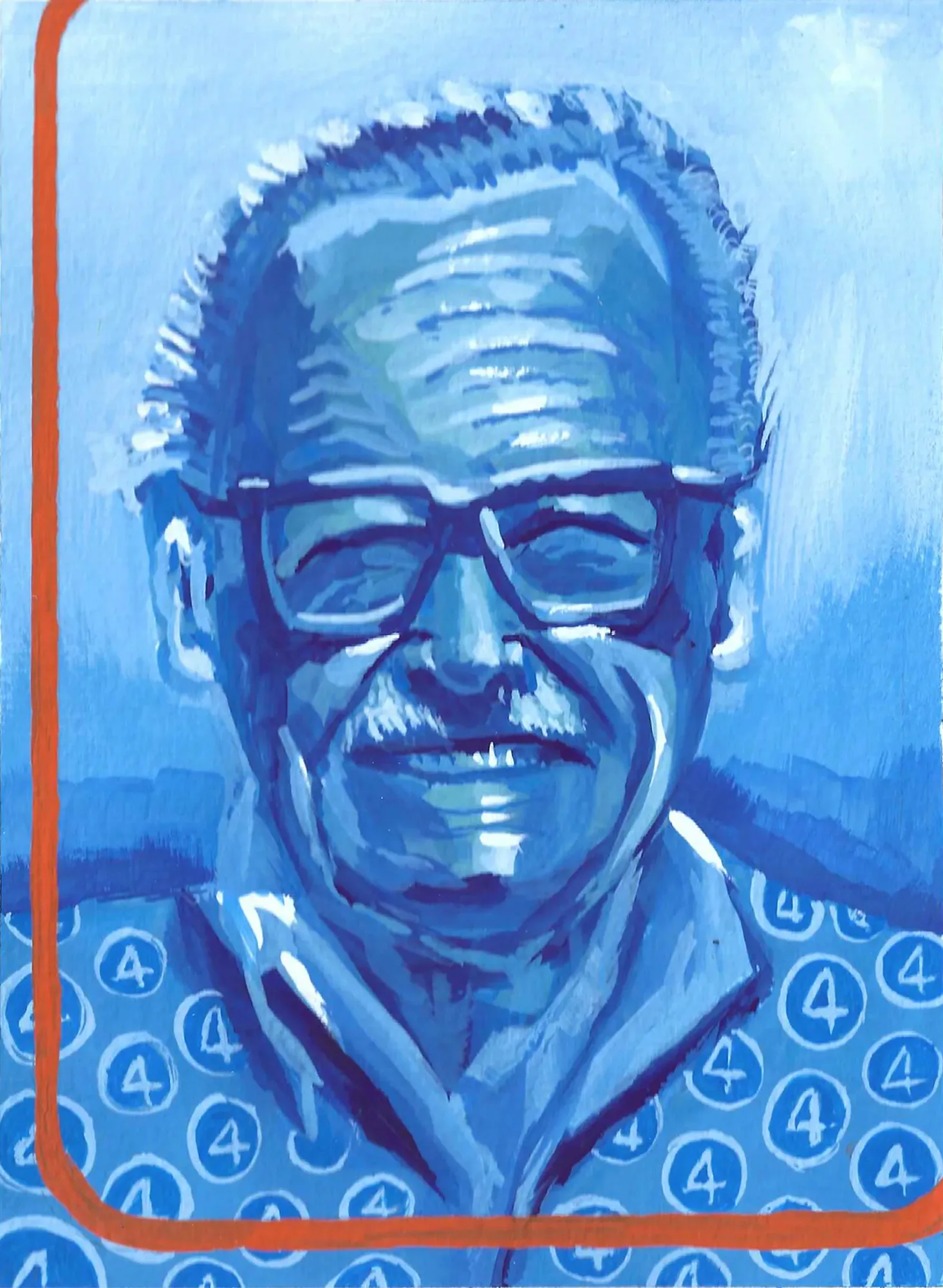
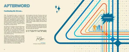
The paper examines Stan Lee’s life, his creative philosophy and his effect on how superhero stories are told. It traces Marvel from the Fantastic Four to the cinematic universe, reads Stan’s Soapbox and Excelsior as social writing rather than sign-offs, and ends by asking whether the heroes we have now still believe what he believed. The cover portrait is the gouache painting from the Fine Art set. Everything else is set in the same system as the artbook.
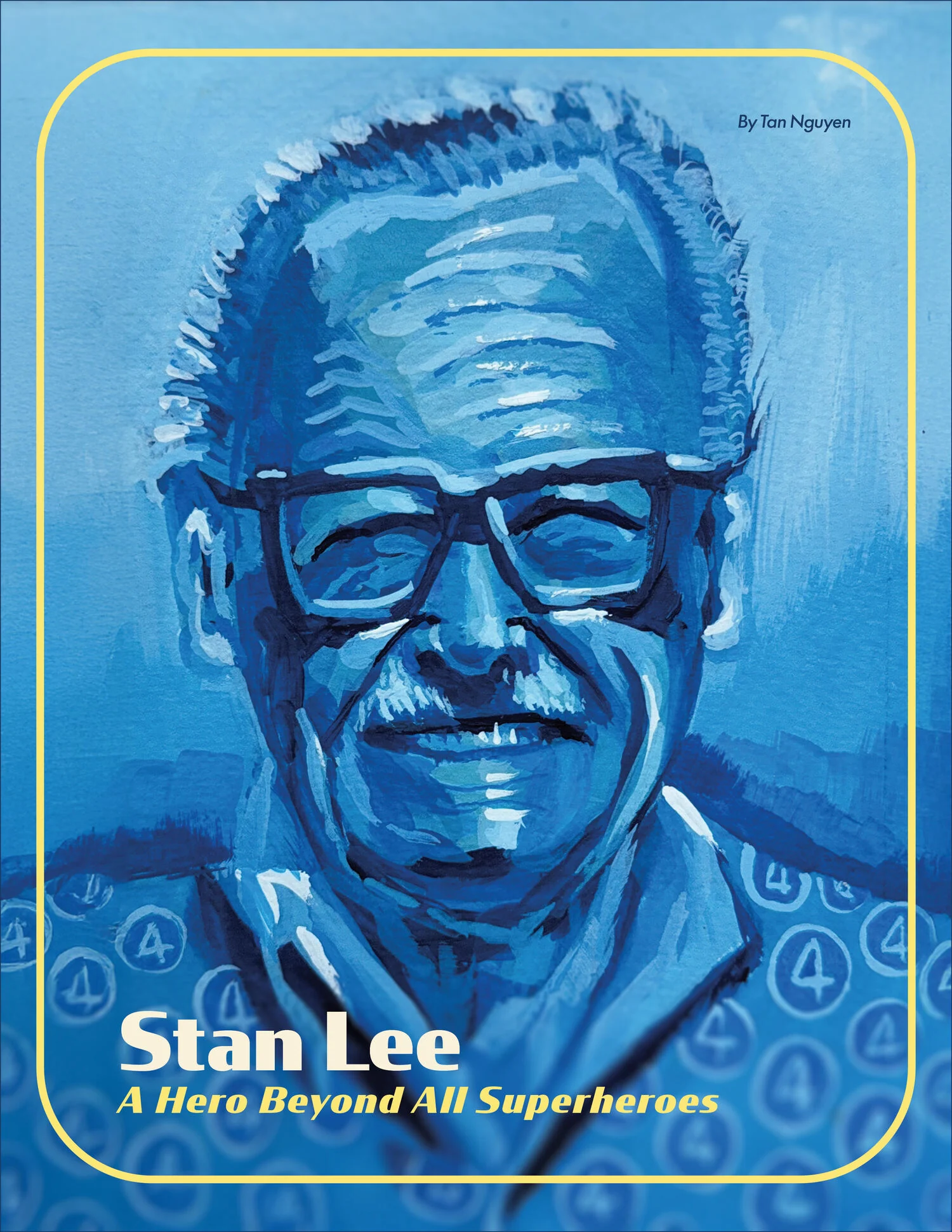 View
ViewCover. The gouache portrait, a hand-drawn keyline, and the subtitle set small enough to be read rather than announced.
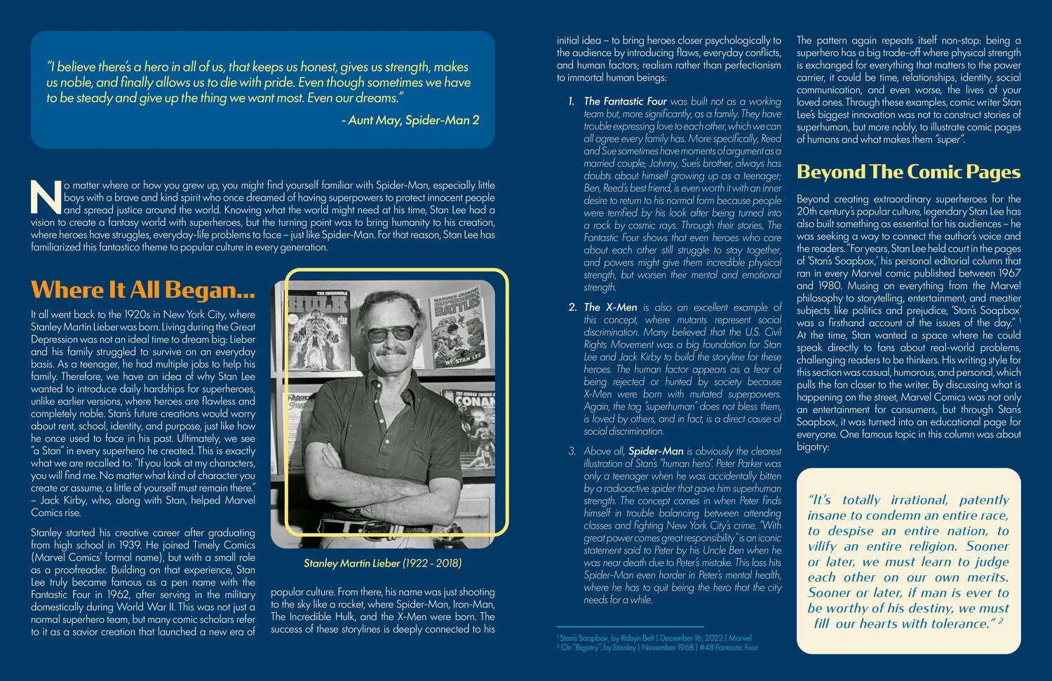 View
ViewWhere It All Began. Two columns of body text against a full-bleed field, with a pull panel holding the first Soapbox quotation.
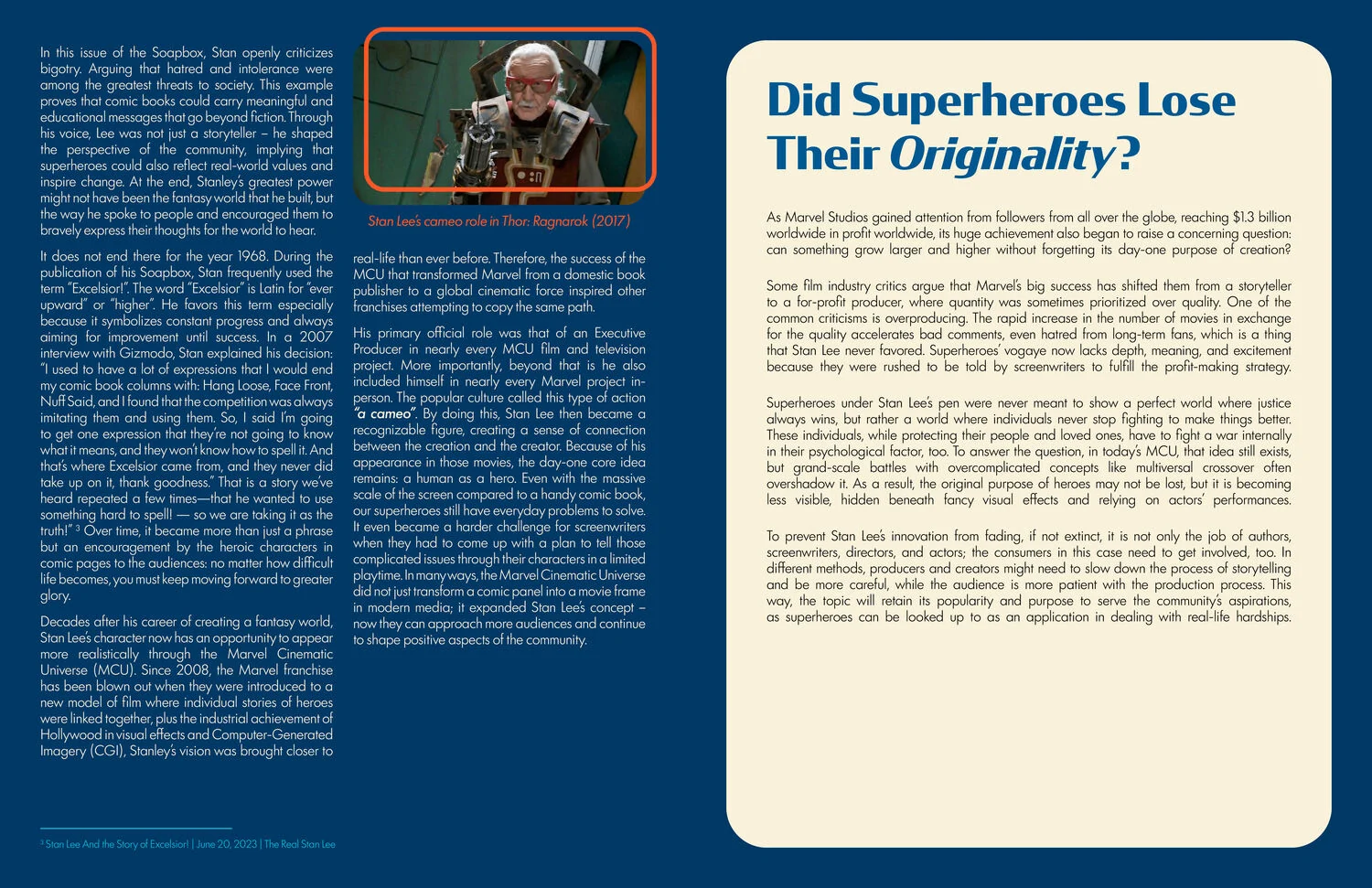 View
ViewBeyond The Comic Pages. Archive photographs set inside the same rounded plates the artbook uses for its film stills.
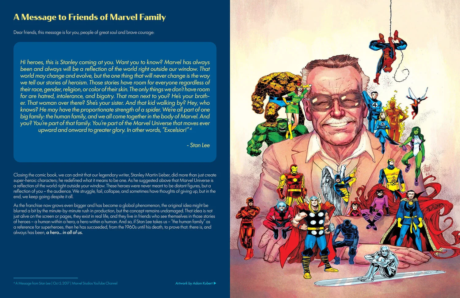 View
ViewThe argument section. The measure narrows here, because this is where the paper stops reporting and starts claiming something.
 View
ViewBack cover.
The paper runs as a saddle stitched magazine rather than a case bound book, so the spreads are read in one sitting and the measure narrows wherever the argument does.
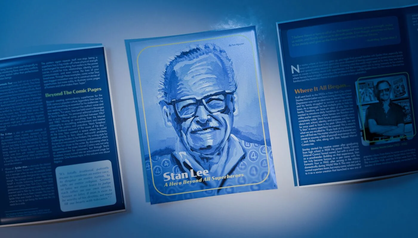 View
ViewOpen flat, top down. Both interior spreads readable at once.
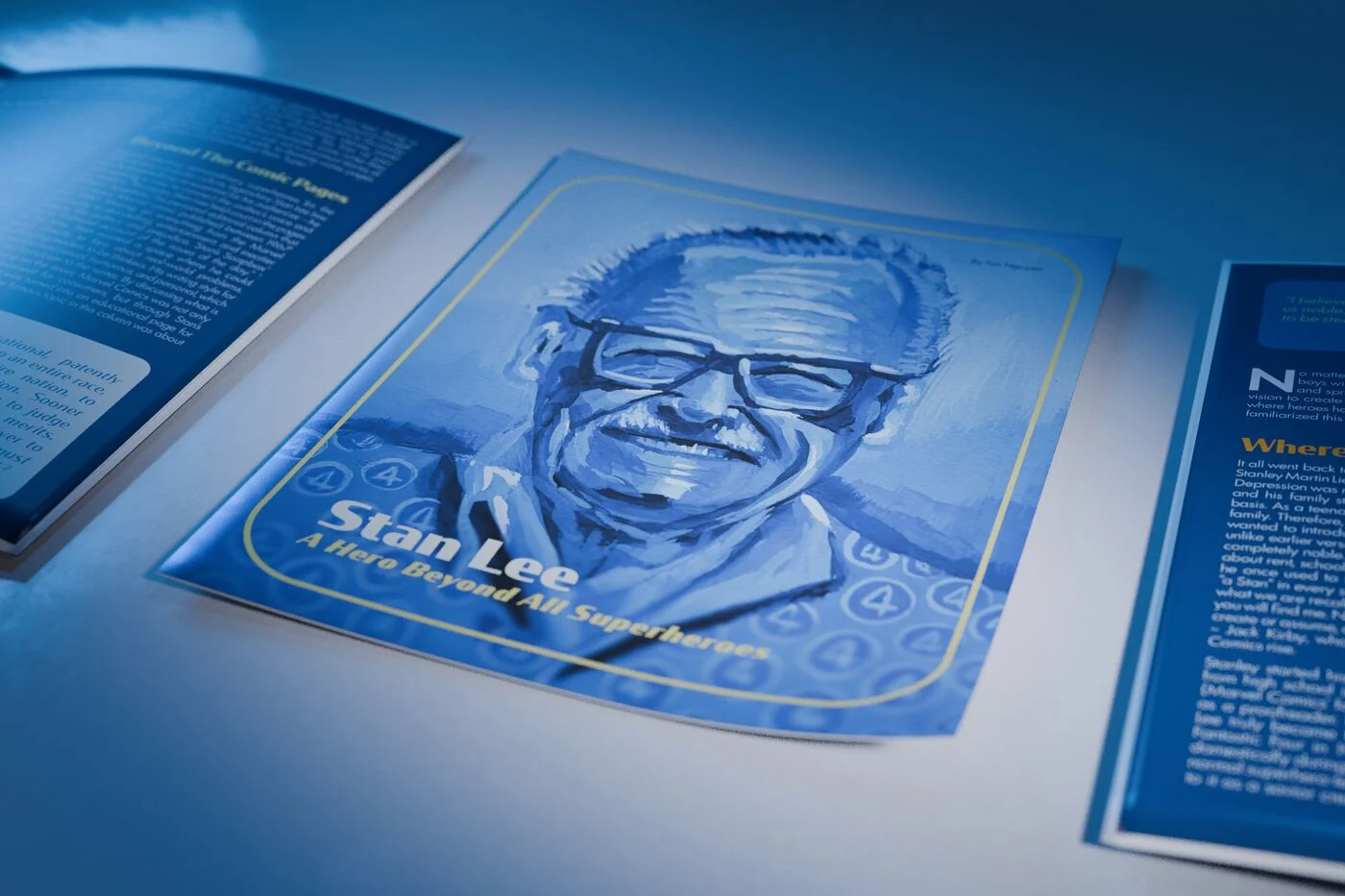 View
ViewCover in the foreground, the open magazine falling away behind it.
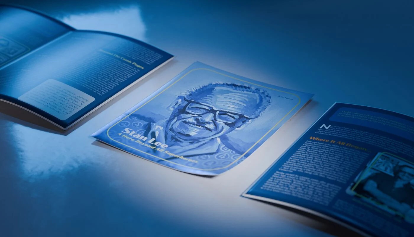 View
ViewThree quarter from the right. The saddle stitch and the paper curl are both visible.
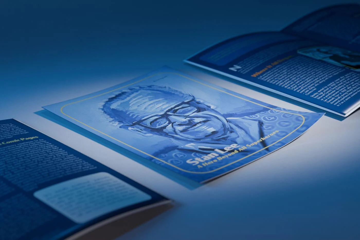 View
ViewThree quarter from the left, same light, mirrored composition.
A system is only a system if the parts travel. These nine were built as assets rather than as illustrations, which is why the book, the posters and both animations look like they came from the same place.

The lockup for The Fantastic Four: First Dreams. It appears everywhere the title lives, from the cover to the flyers to the end card of both animations. Drawn once, never re-set.
The circled four. In this system it also replaces the numeral four inside words, which is the only piece of wordplay the book allows itself.

A speech container with a retrofuturist tail. Used on artbook spread 30 and again inside the Four Fingers poster.

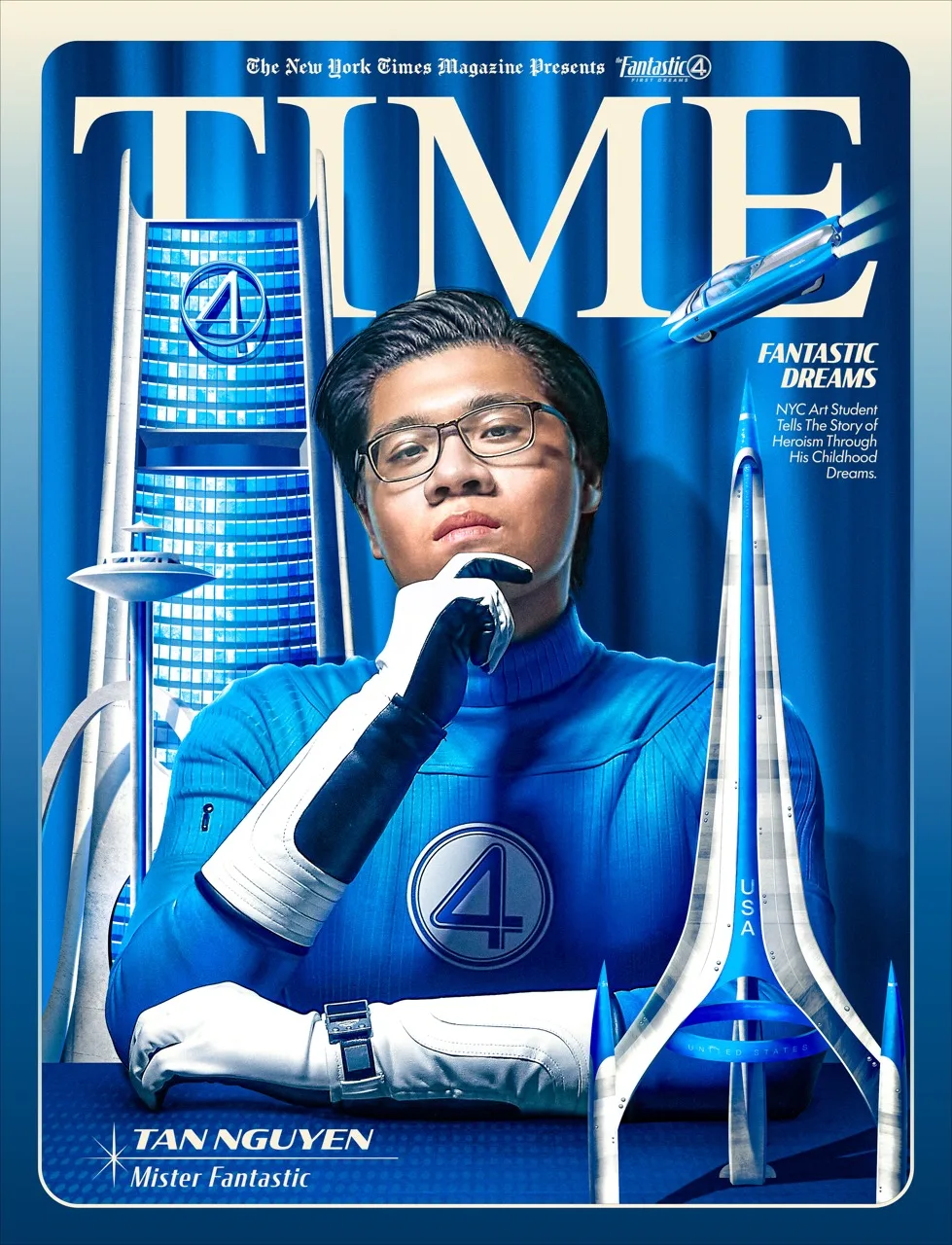
The credit plate. It carries my name on artbook spread 7 and again along the foot of the NY Times Cover poster.
A mock imprint lockup, built to sit inside the Mister Fantastic chapter as if it had been photographed off a real cover.

The horizontal Future Foundation lockup. Sue is the only member with a second identity system inside her chapter.

The stacked mark, for square and centred positions.

The invented broadcast credit. It closes the holiday animation and gives the television framing device a name.

Four and six pointed starbursts. They set the era faster than any other element, and they are the reason a nearly empty spread still reads as designed.
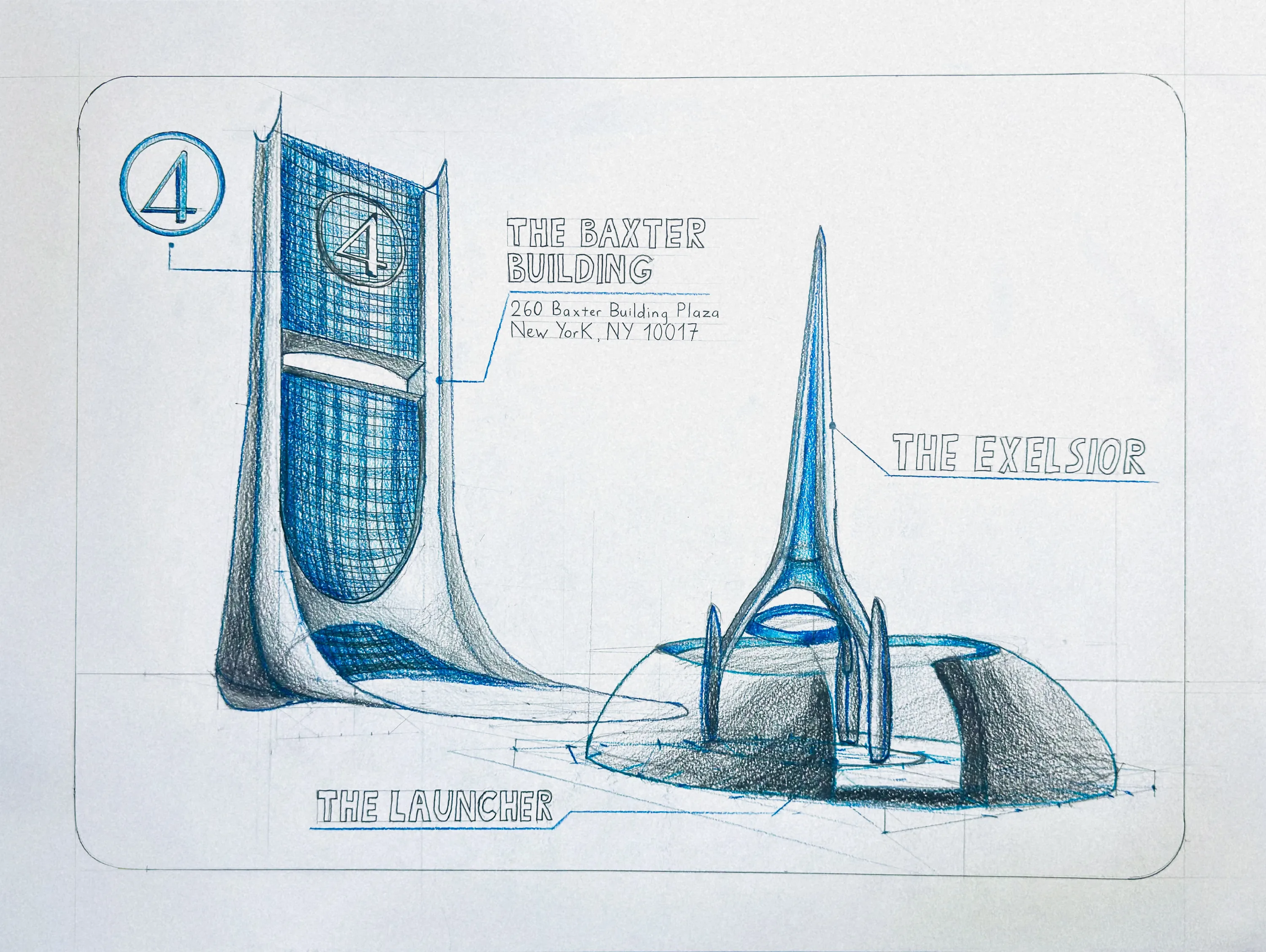
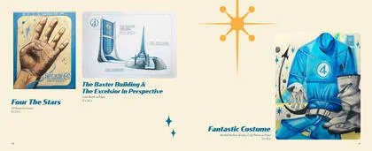
Usable reference for these did not exist online, so I bought Marvel’s own art book and rebuilt them. Each one starts as flat massing in Illustrator and ends as a lit surface in Photoshop. Drag any handle.
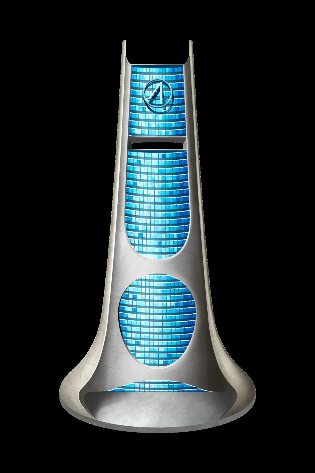
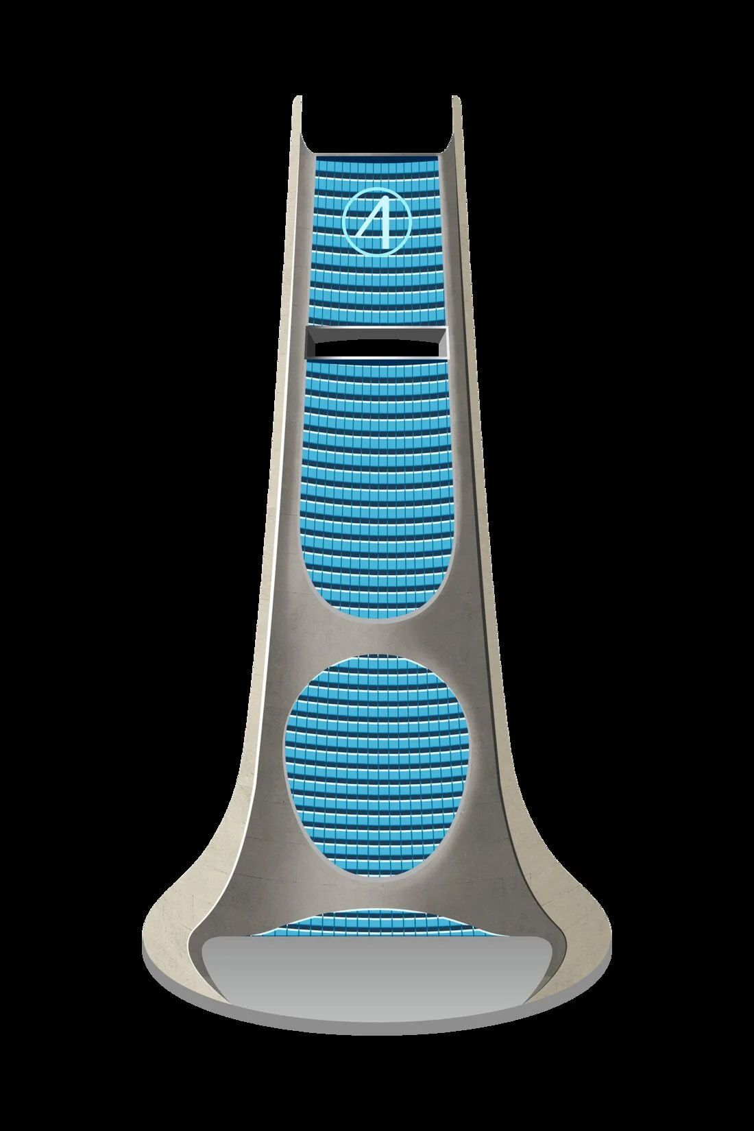
The tower. Massing and window banding drawn flat in Illustrator, then glass, concrete and the crown built in Photoshop. The block-in decided every proportion before a single surface existed.
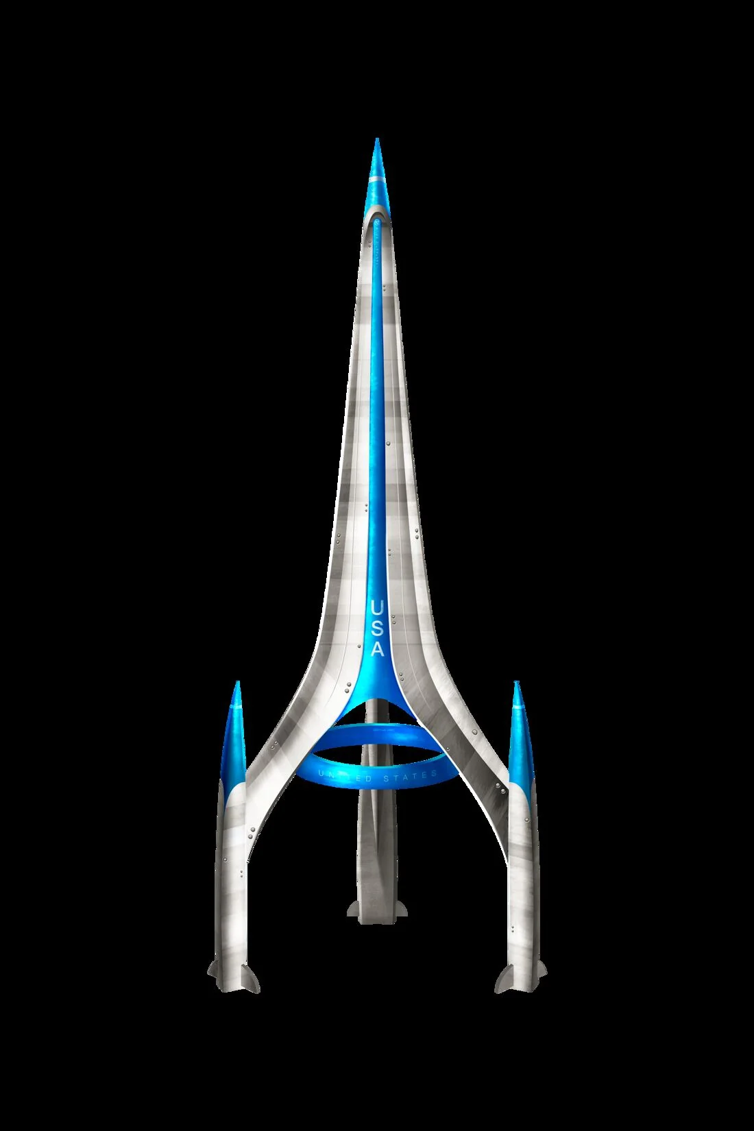
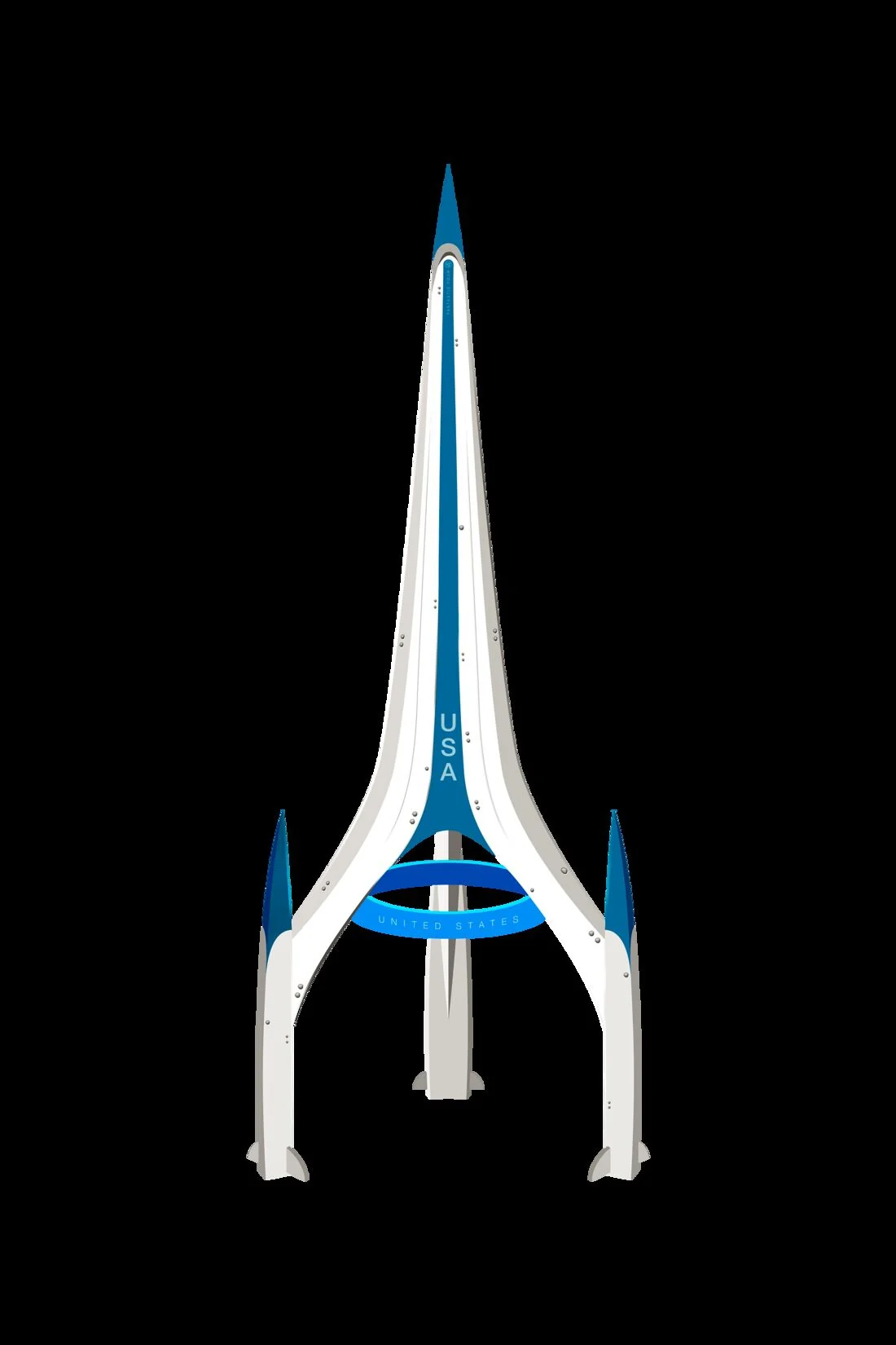
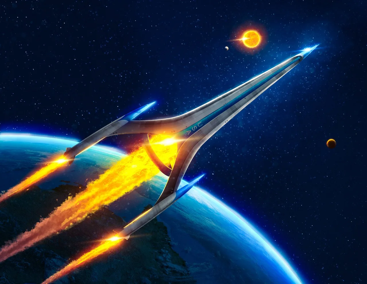
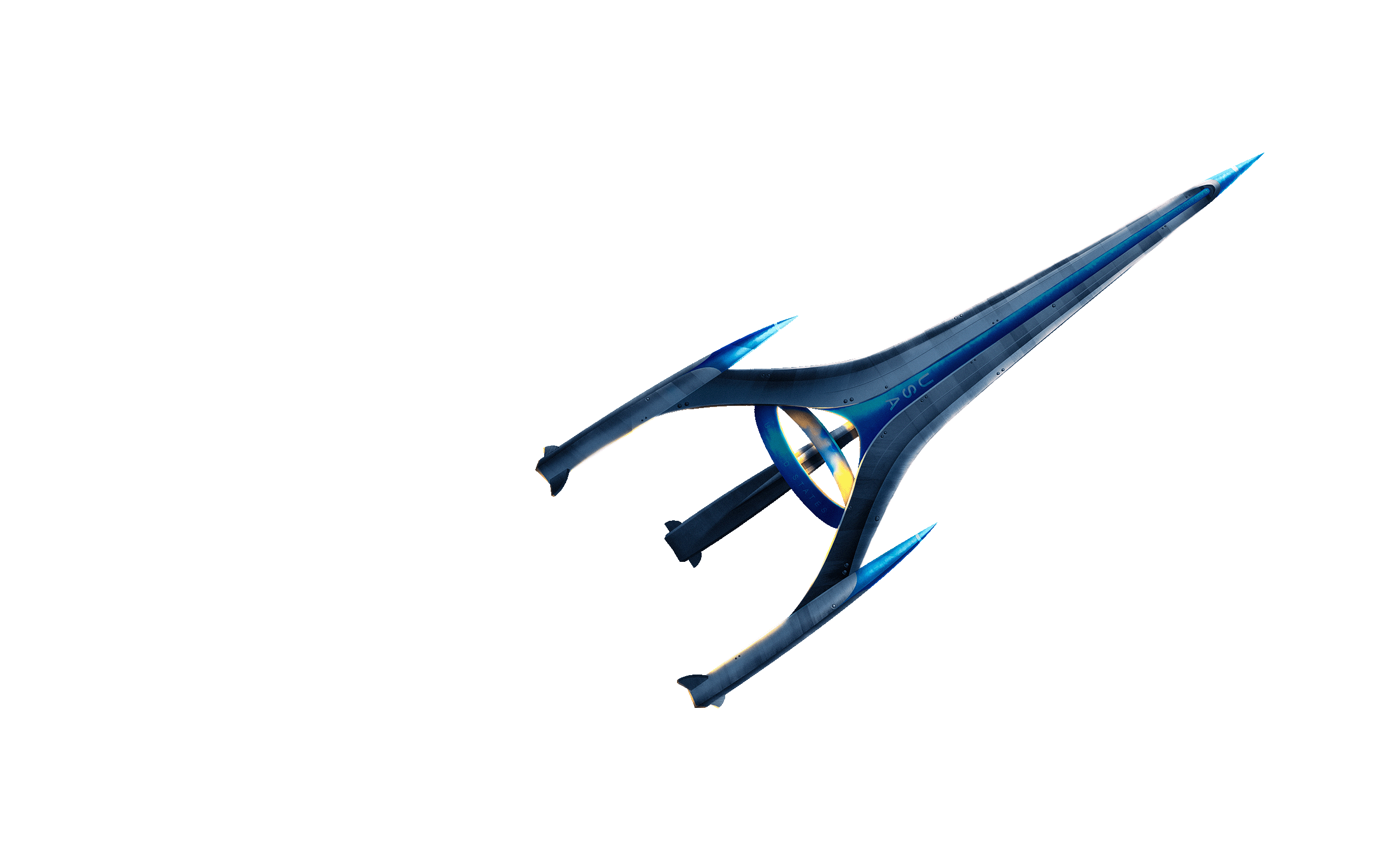
The ship. Swept silver hull, blue wingtips, four engines. Built once so it could be reused across the whole project rather than redrawn every time it appears.
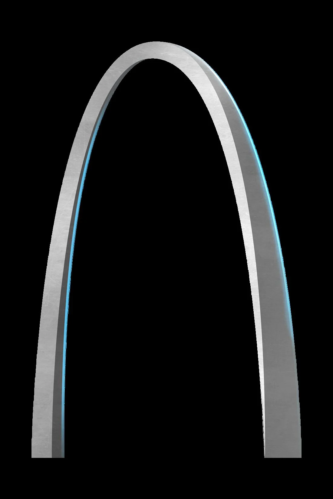
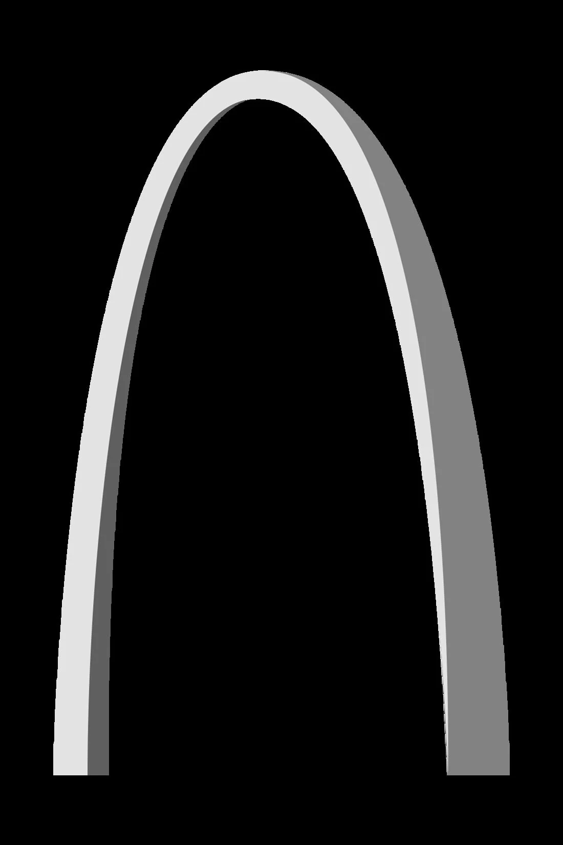
A ring structure that reads as infrastructure rather than architecture. The block-in decided the perspective and the material pass decided whether it felt heavy enough to be real.
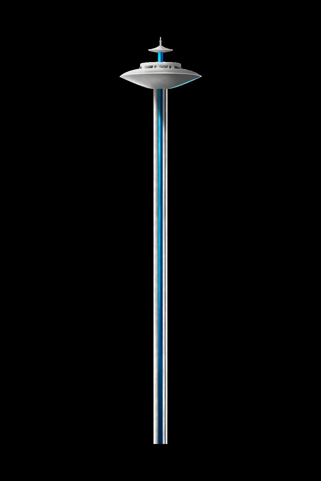

The smallest of the four and the hardest to make convincing, because a dome has nowhere to hide a bad curve. Drag the handle to see how little of it survived the block-in unchanged.
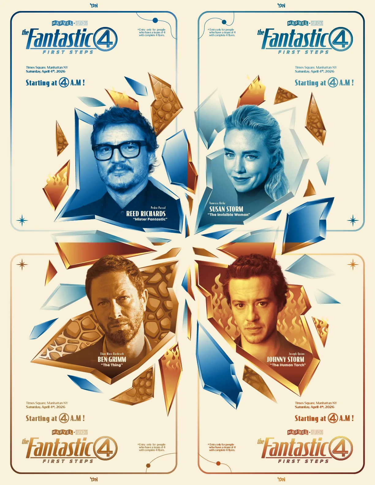
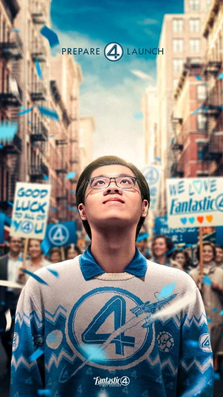
Five lighting setups over one night on a borrowed mirrorless body, culled in Capture One, built in Photoshop. The costume was bought for Halloween and then had to earn its keep.
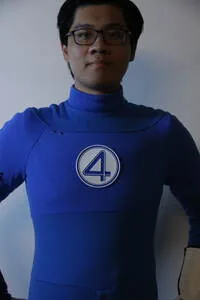
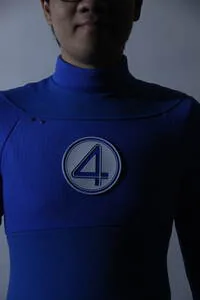
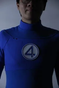
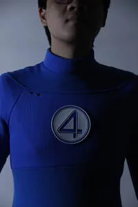
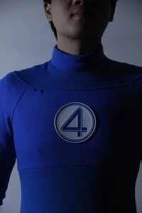
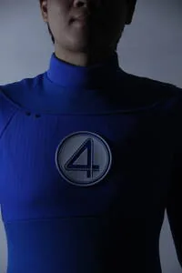
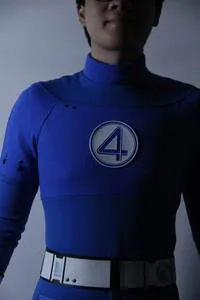
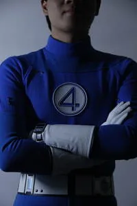
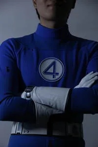
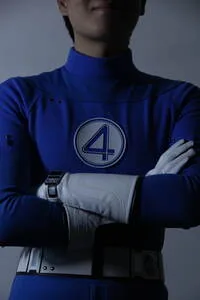
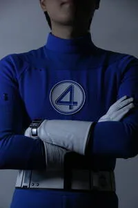
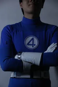
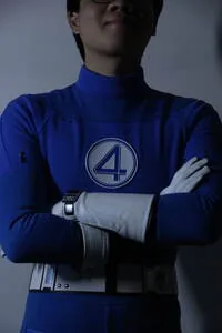
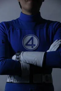
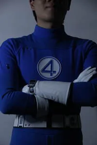
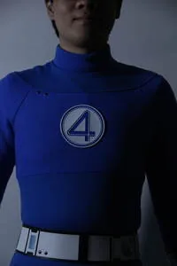
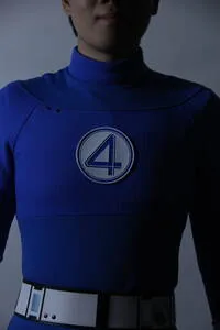
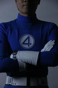
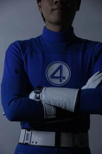
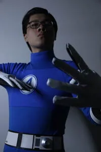
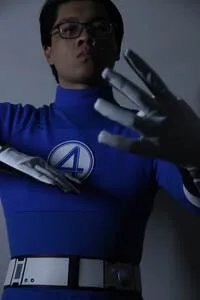
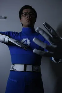
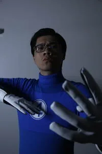
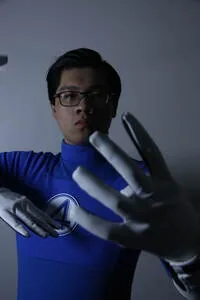
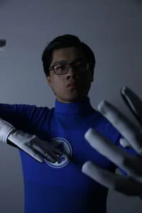
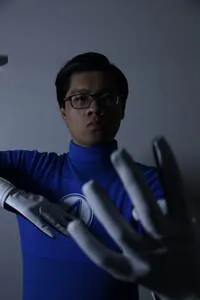
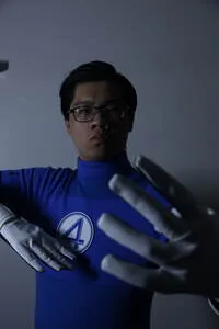

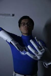
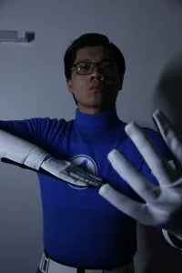
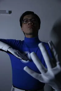
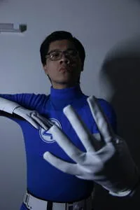
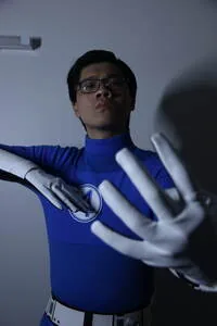
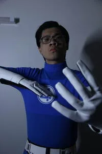
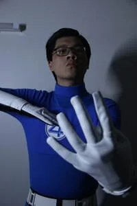
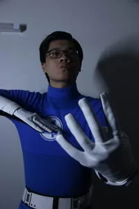
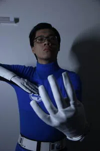
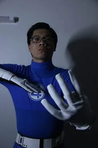
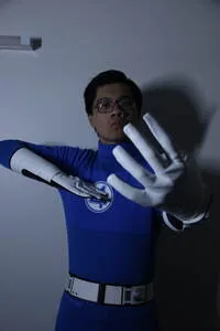
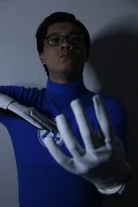
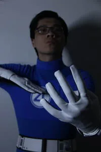
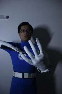
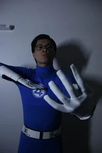
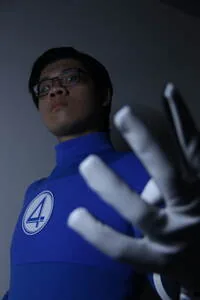
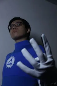
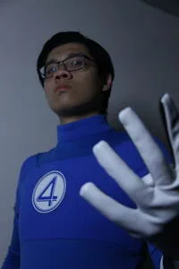
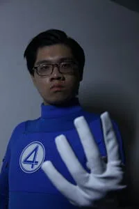
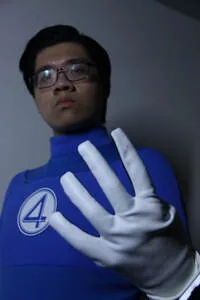
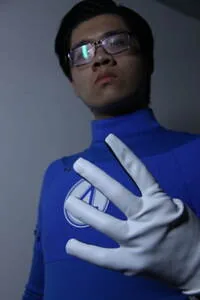
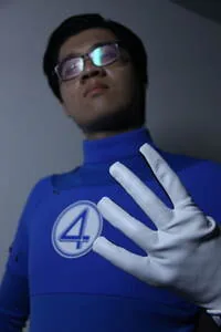
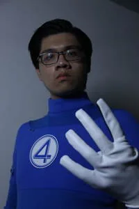
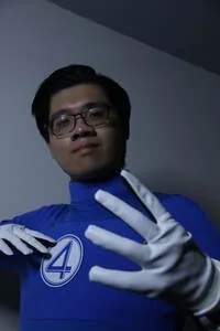
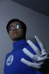



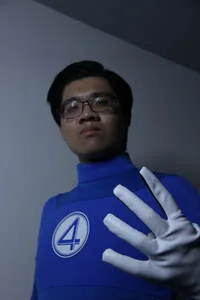
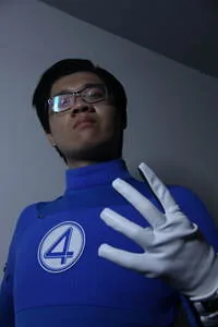
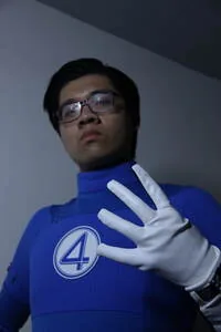
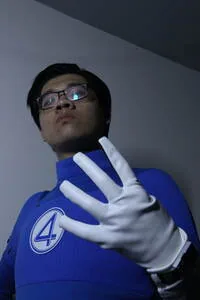
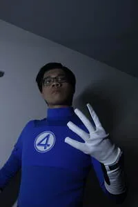
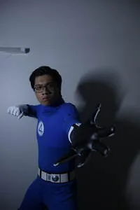
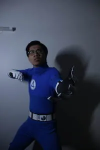
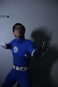
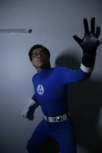
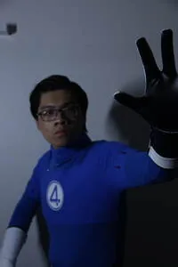
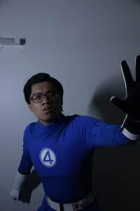
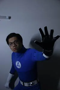
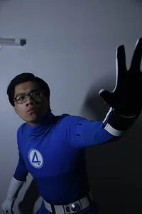
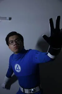
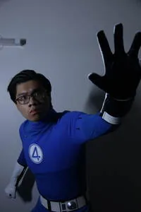
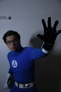
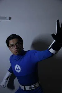
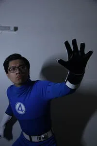
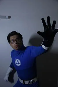
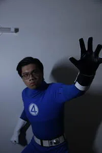
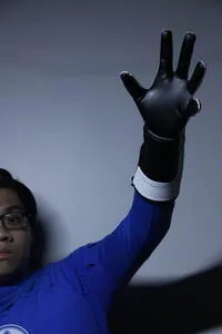






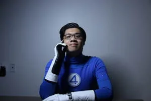


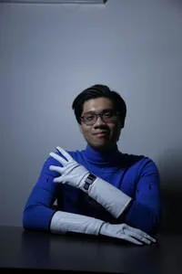
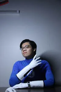
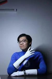
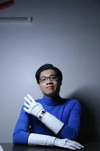
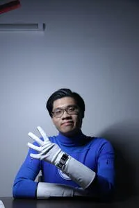
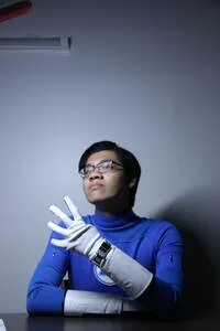

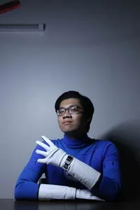
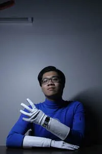
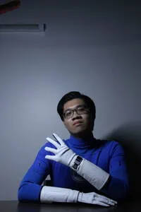
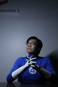
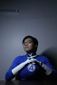
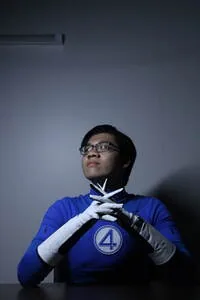
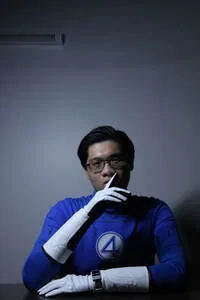
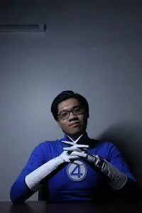
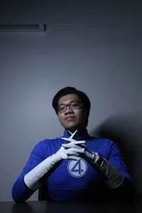
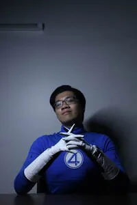
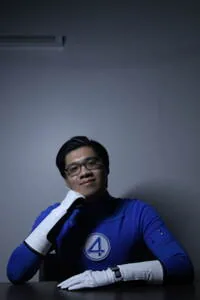
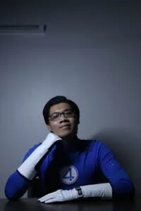
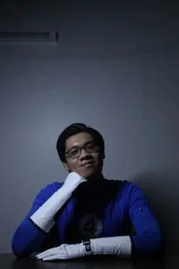
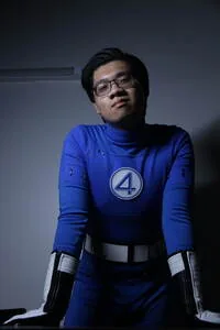
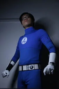
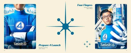
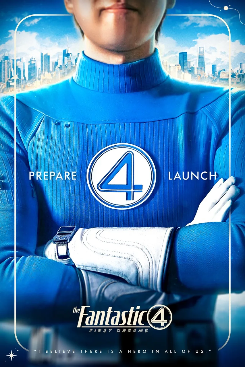
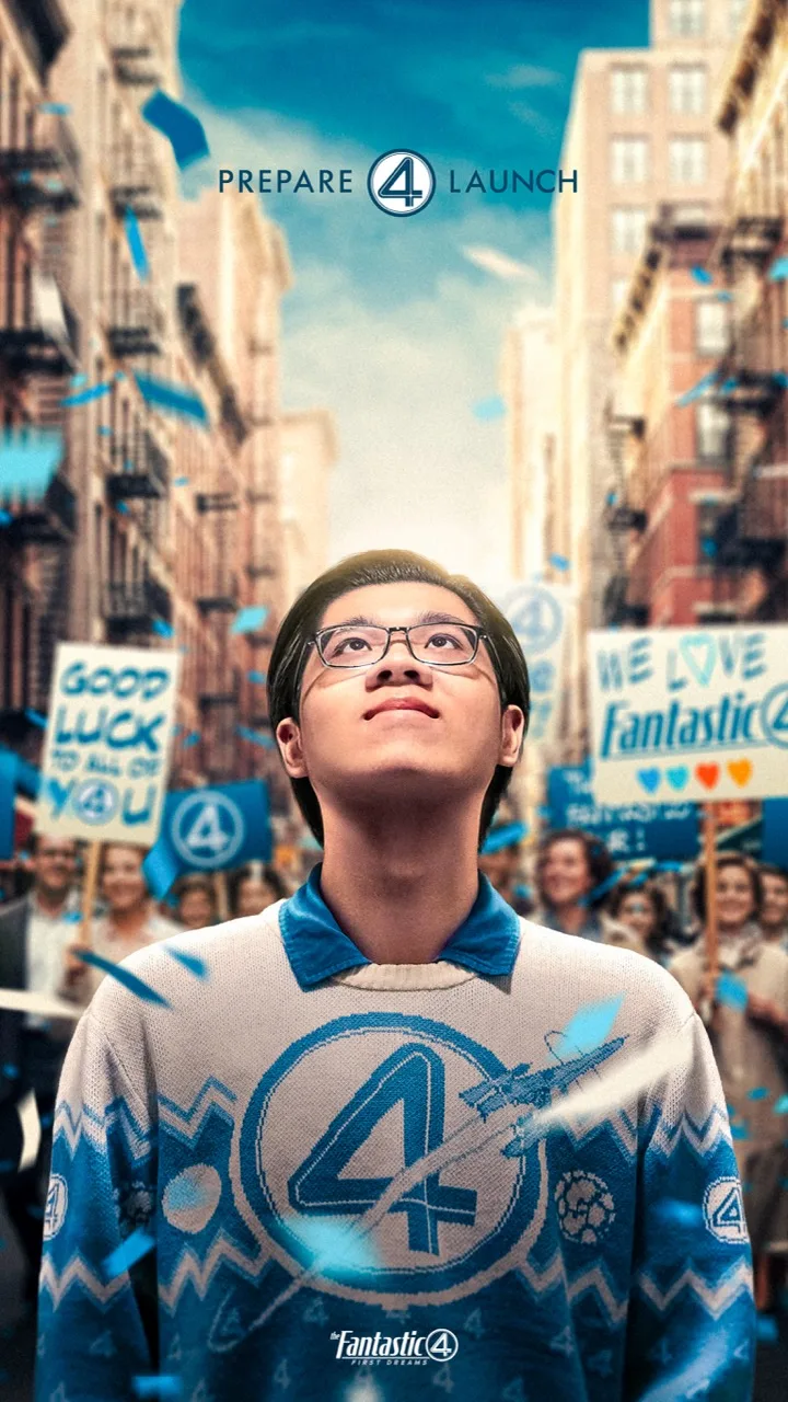
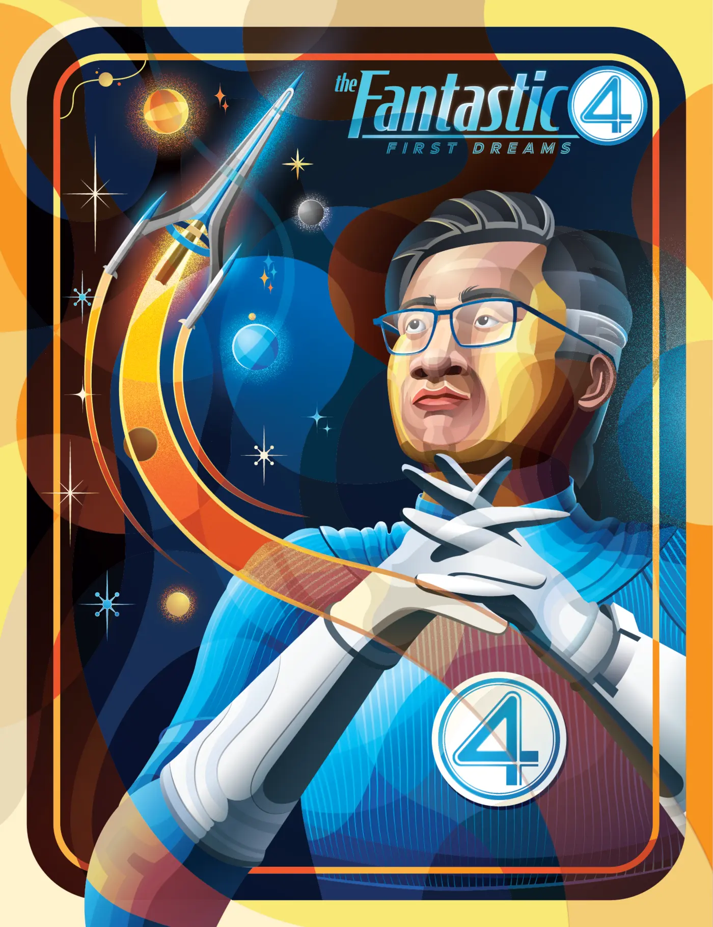
Prepare 4 Launch · Four Finger direct · Four Finger low · Save The World · Table.
 View
ViewPrepare 4 Launch Face cropped at the mouth on purpose. The poster is about readiness, not the person.
 View
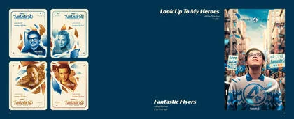
ViewFour Fingers Framed like a trading card, because a trading card is how I first met these characters.
 View
View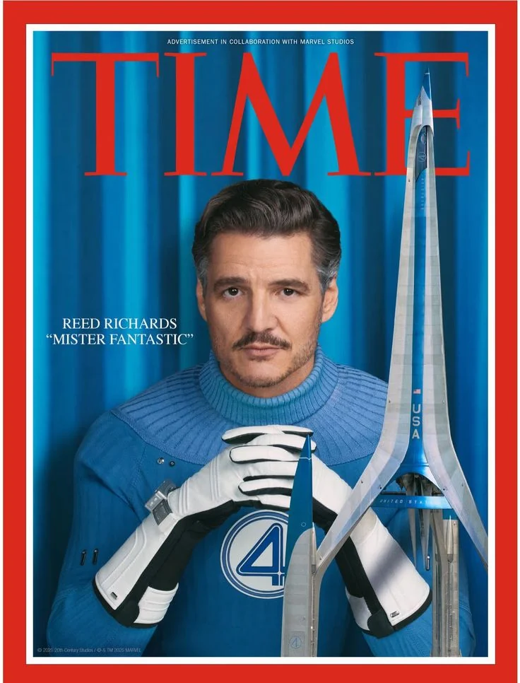 View
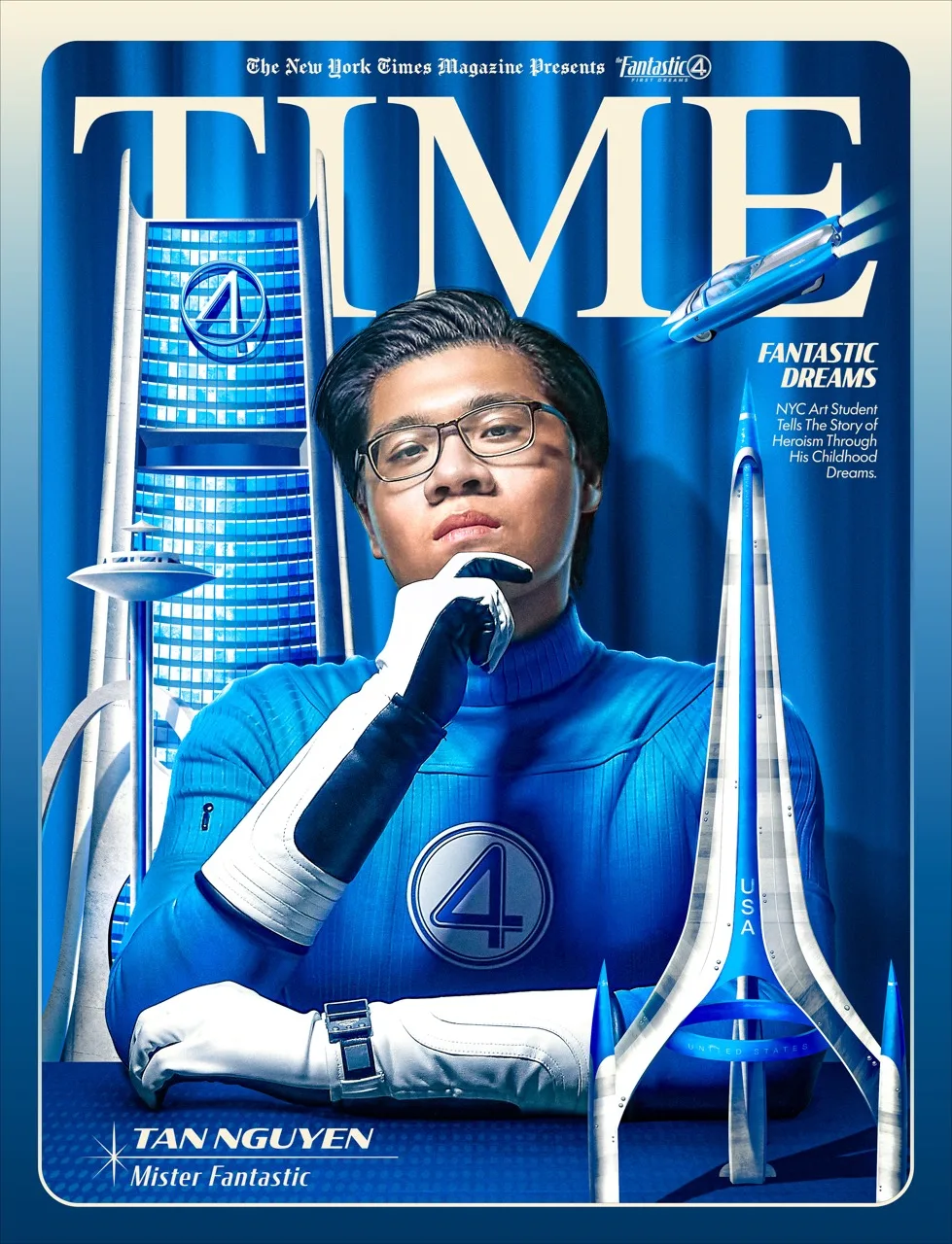
ViewNY Times Cover A whole cover system, masthead to footline, not a photo with type on it.
 View
View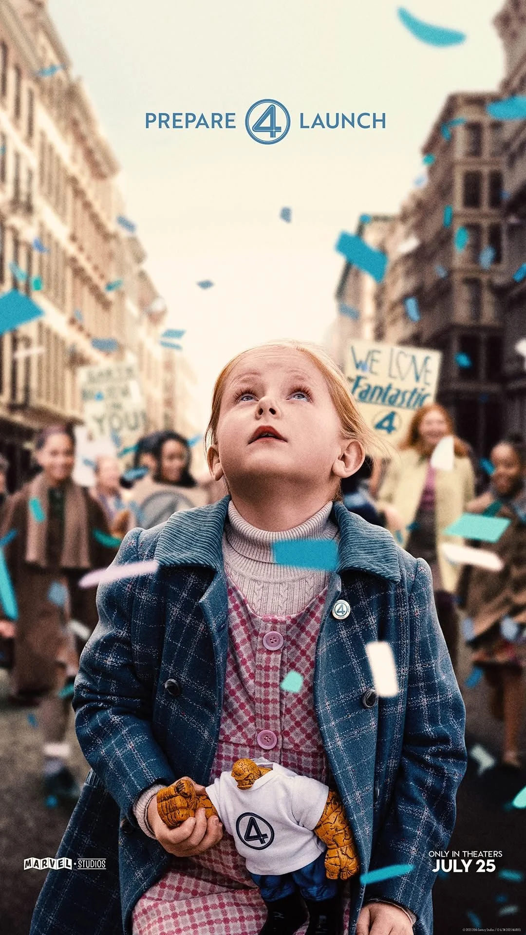 View
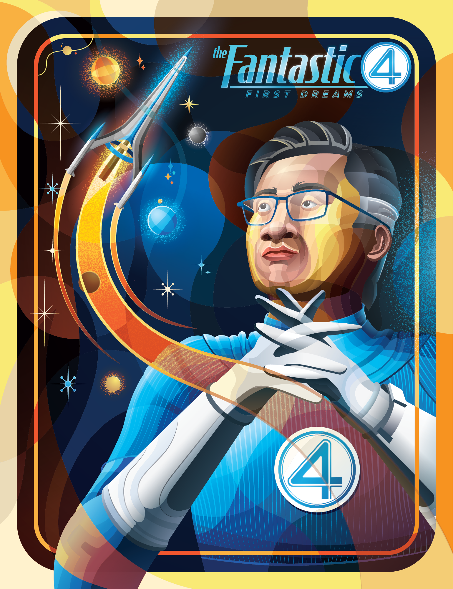
ViewLook Up To My Heroes Built entirely around the direction of one gaze, the only thing I did not construct.
 View
ViewFirst Dream Pencil, then line, then fill. The first stage decided the other two.
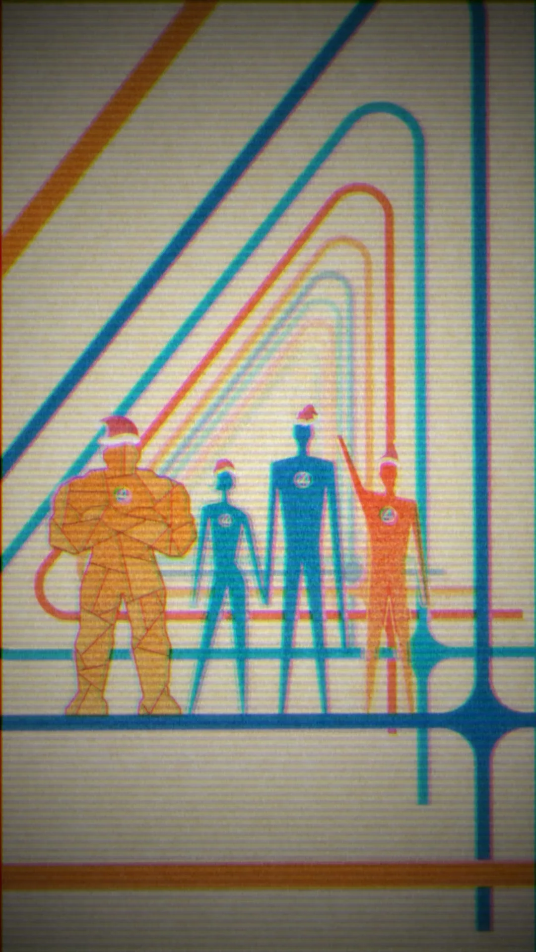



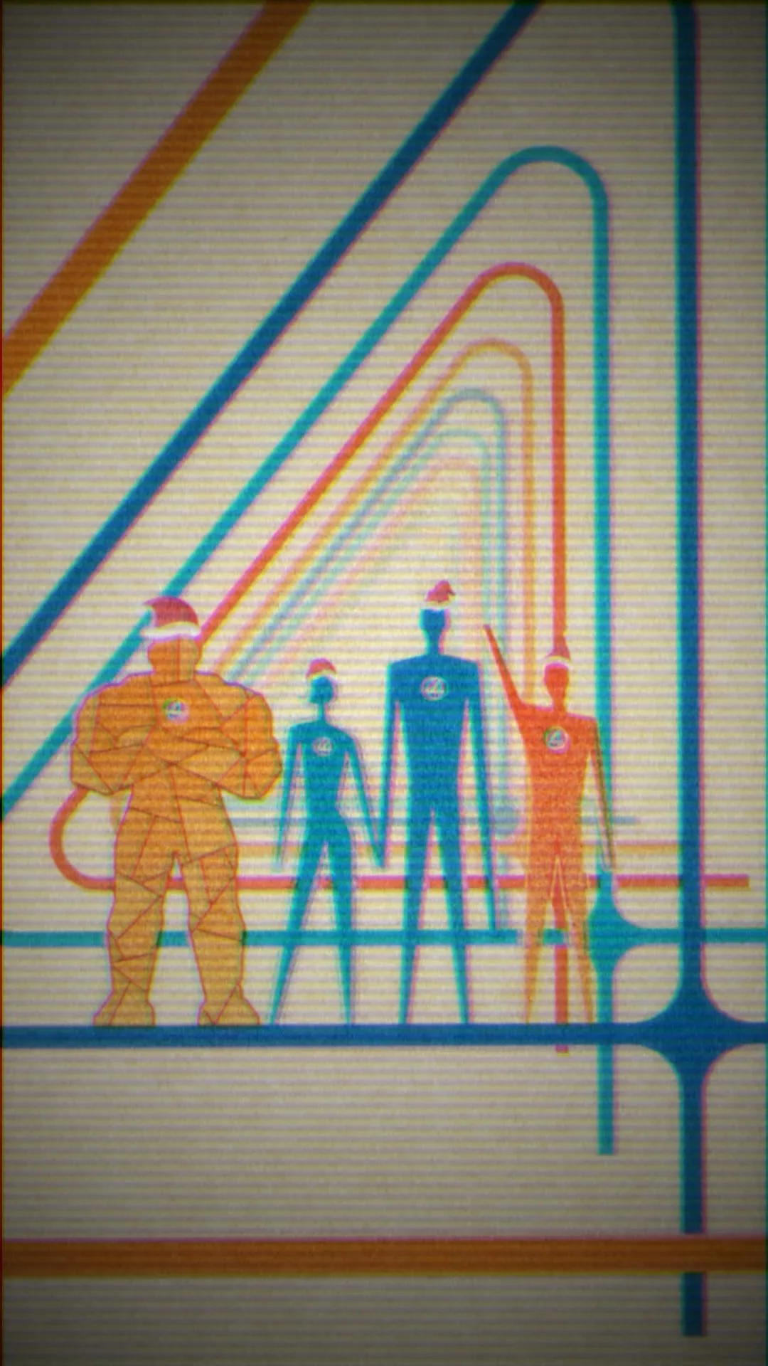
Vertical, built for a phone, carrying the grain and glow of an old television set. Four flat figures in Santa hats inside rounded outlines that recede behind them. The greeting puts the circled four where a letter should be.
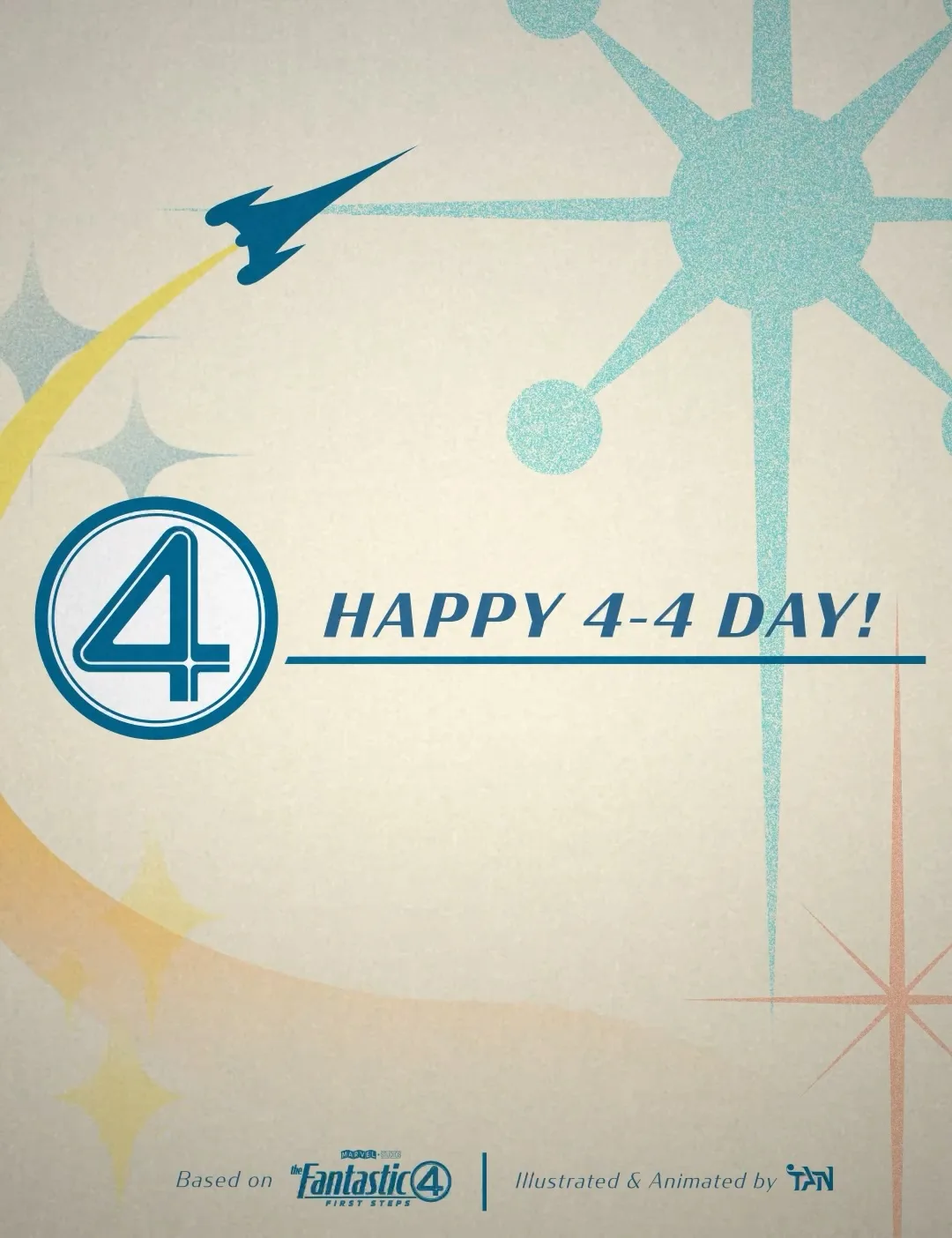
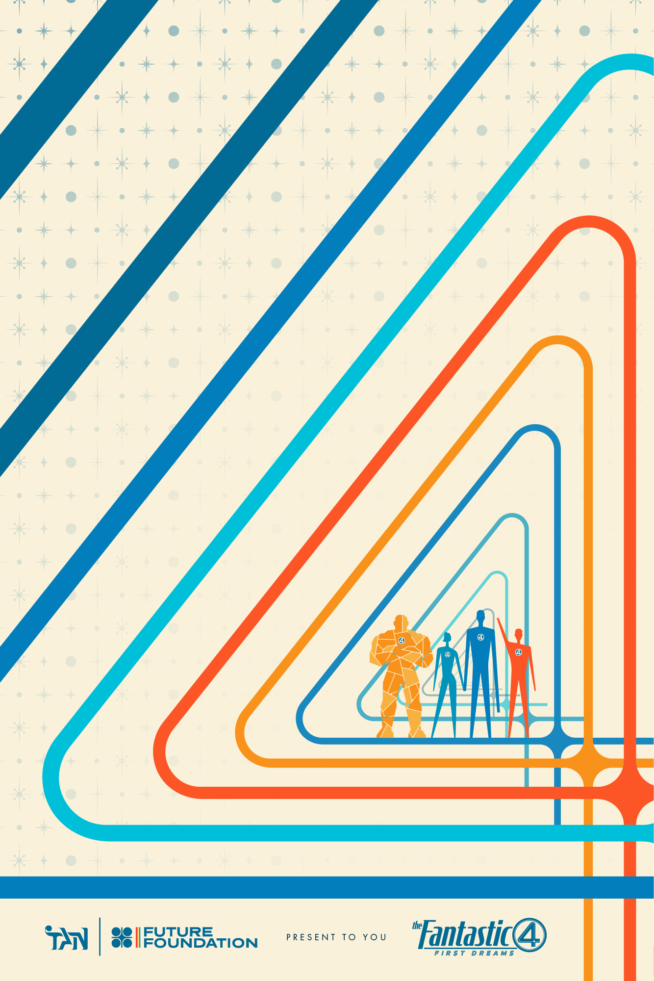
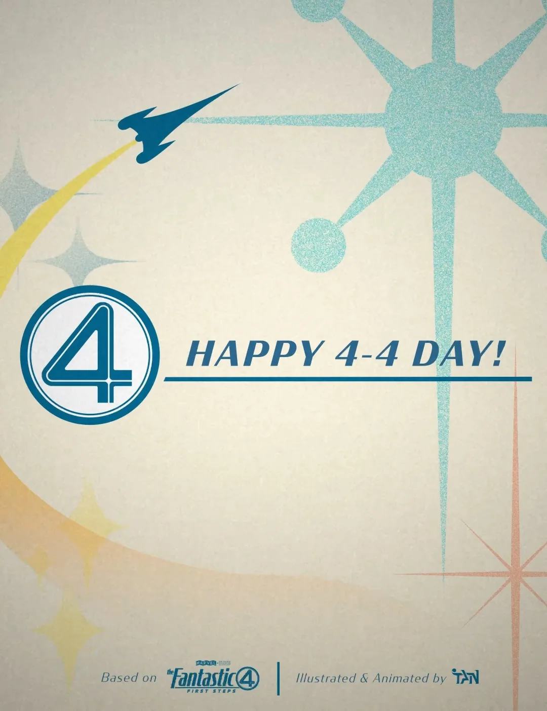
The fourth of April is 4-4, which is enough of an excuse. Atomic starbursts on cream, the Excelsior drawing itself in blue line before any fill arrives, then the circled four snapping into place over a yellow contrail.
Two short pieces, both vertical, both built for a phone. They are where the television framing device stops being a layout idea and becomes a transition.
Sorted the way the site sorts them: medium in a fixed order, then how much weight the piece carries, then date. Click any tile to open its page.
The Fantastic Four climbed into a rocket to see the other side of the sky and came back as something they had not planned to be. Three of seven missions are still unwritten, nothing has been through a press, and that is the honest state of it.
A dream is a room you build before you know how to build anything. Sixty four pages in, I know a little more about building. I know that a palette is a promise you make to your future self, that a grid is only worth having if you can feel it when you break it, and that the fastest way to find out whether an idea is real is to set it in type at full size.
Three missions are still unwritten. The cover sleeves are still an idea. Nothing here has been through a press. I would rather show you a project that is honestly halfway than a finished thing that never had to survive a deadline.
The Fantastic Four begin with ambition rather than tragedy. Four people climb into a rocket because they want to see what is on the other side of the sky. That is the whole reason I chose them, and it is still the reason I keep going.
Credits
Concept
Tan Nguyen
Research
Tan Nguyen
Writing
Tan Nguyen
Design
Tan Nguyen
Photography
Tan Nguyen
3D
Tan Nguyen
Motion graphic
Tan Nguyen
Special thanks
Book Design Instructor
Marko Kovacevic
Painting Instructor
Simone Couto
Drawing Instructor
Mary Jones
Specification
Trim
10 x 8 in, landscape
Spread
20 x 8 in
Bleed
0.125 in
Extent
64 pp
Spreads
33
Stock
170 gsm
Spine
Square, 9.94 mm
Type
Condor, Futura, Neuwelt
Built in
InDesign
Borrowed imagery
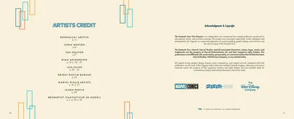
Roshfaizal Ariffin
p. vii
Chris Weston
p. 14
Tan Nguyen
p. 17
Ryan Meinerding
p. 18, 28 to 29
Luis Felipe
p. 22 to 23
Hriday Raktim Baruah
p. 24
Marvel Rivals artists
p. 19, 27
Jason Parvik
p. 29
BR3D Artist, Fantasticar 3D model
p. 2, 37, 39
The Fantastic Four: First Dreams is an independent, non-commercial, self-initiated publication made for educational, artistic and portfolio purposes. The Fantastic Four, Marvel, Marvel Studios and all associated characters, names, logos and trademarks are the property of Marvel Entertainment, LLC and their respective rights holders. This project is not affiliated with, endorsed by, sponsored by or commissioned by Marvel Entertainment, Marvel Studios, The Walt Disney Company or any related entity. All original writing, design, layout and artwork are by Tan Nguyen unless otherwise credited. Not for sale.